


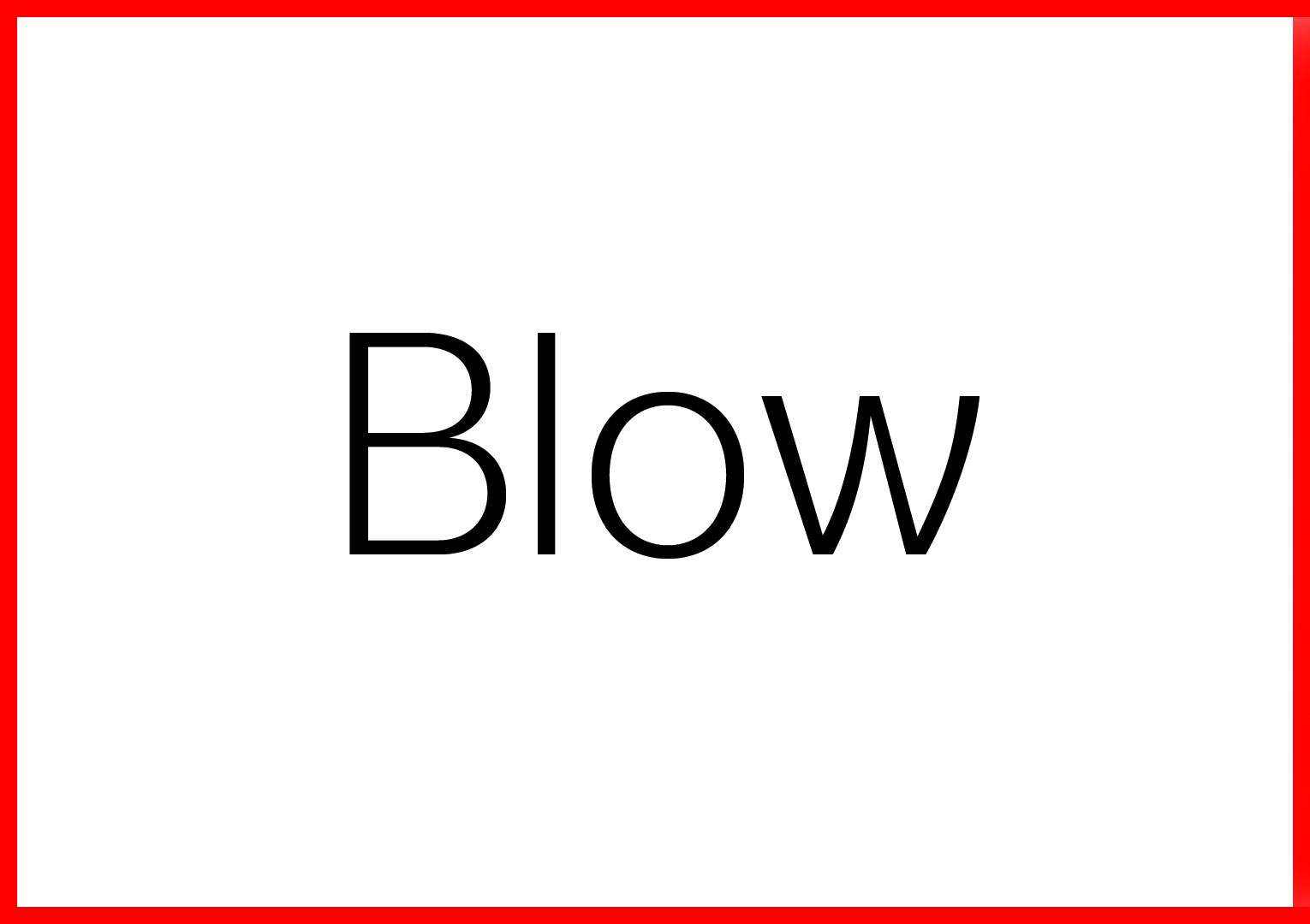
BLOW
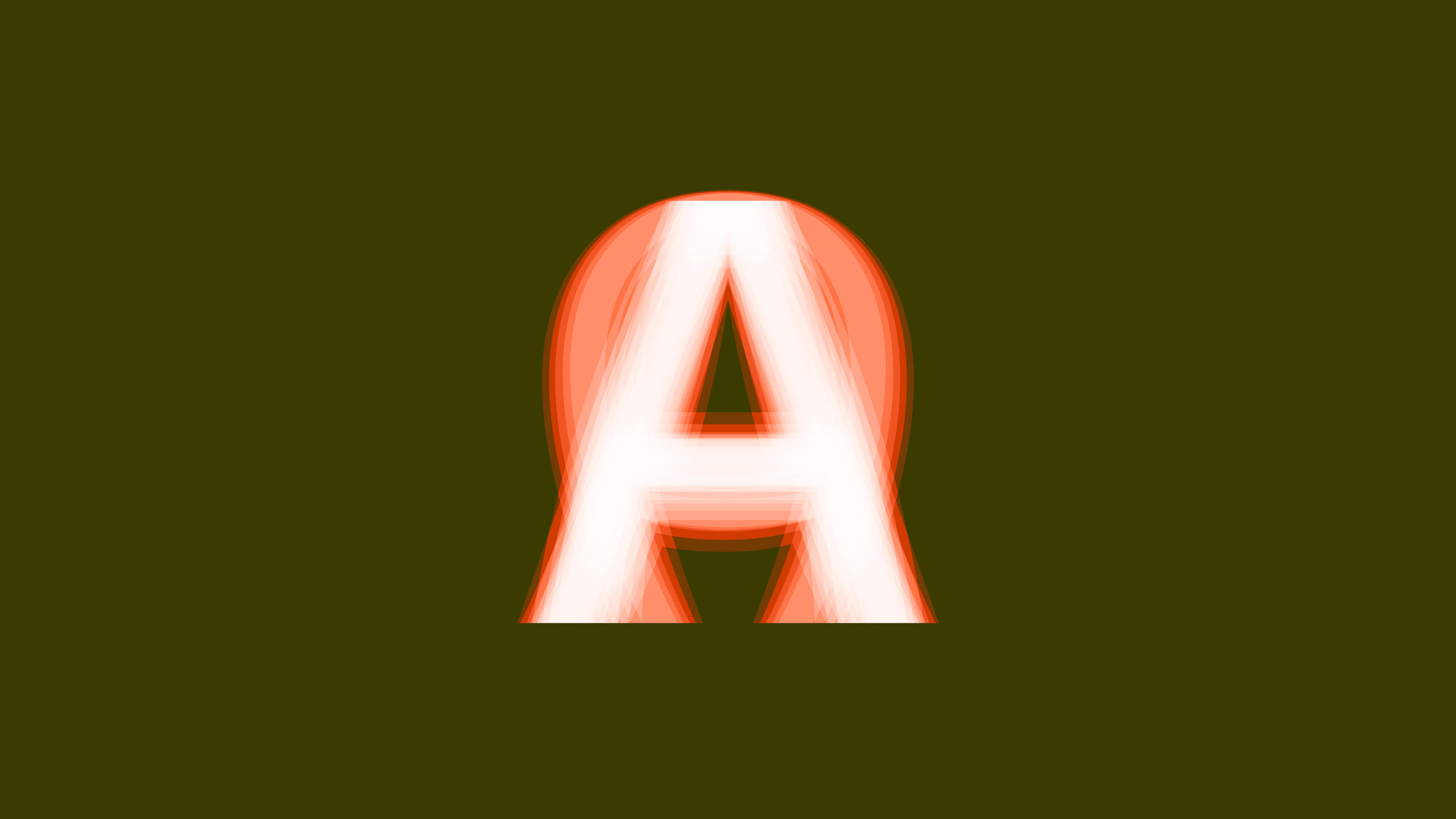
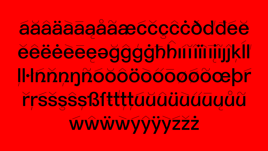
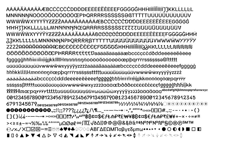
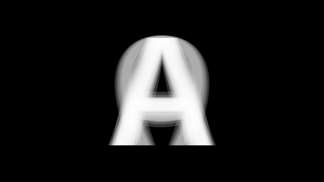
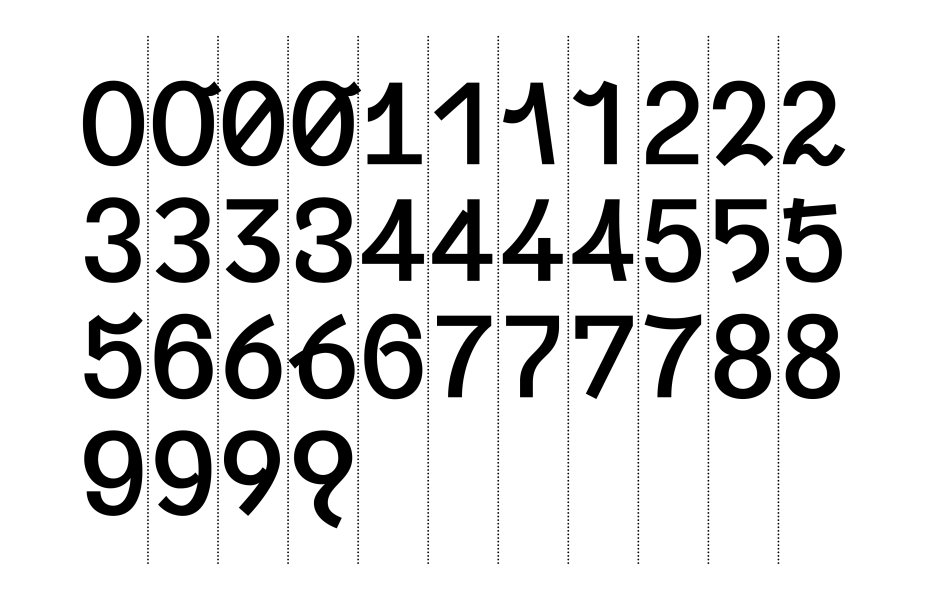
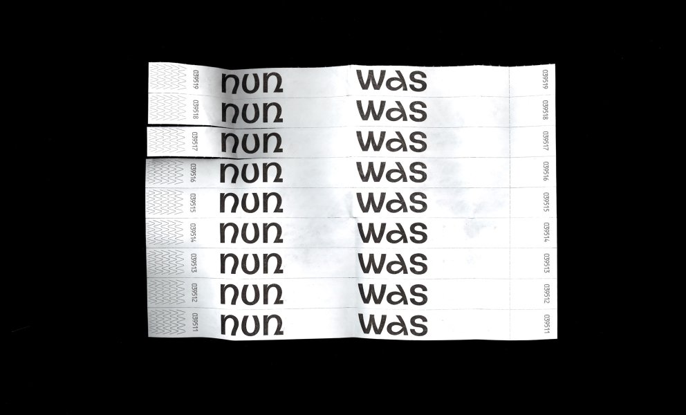
Blow is a dynamic sans serif in five weights. Rooted in medieval style, Blow shifts from firm forms into smooth curves and waves. For each alphabet and figures, numerous alternates come in three steps, taking the idea of hard and soft forms with each step a bit further. The typeface ranges from graphical strengths to dynamic elegance. While the main stroke remains linear, the soft curves alternate with strong straight lines, merging into each other and forming the unique characteristics of Blow in all of its five weights. Letters like the lowercase ‘n’ unite both areas in the default characterset beforehand, while other forms emerge within their alternates: For example, the straight stems of the uppercase ‘A’ slightly curve inward, outward, just to transition into a streamlined form. Purposefully used, Blow allows the designer to have a lot of options to work with.
Design support by Gabriel Richter
Download the Specimen