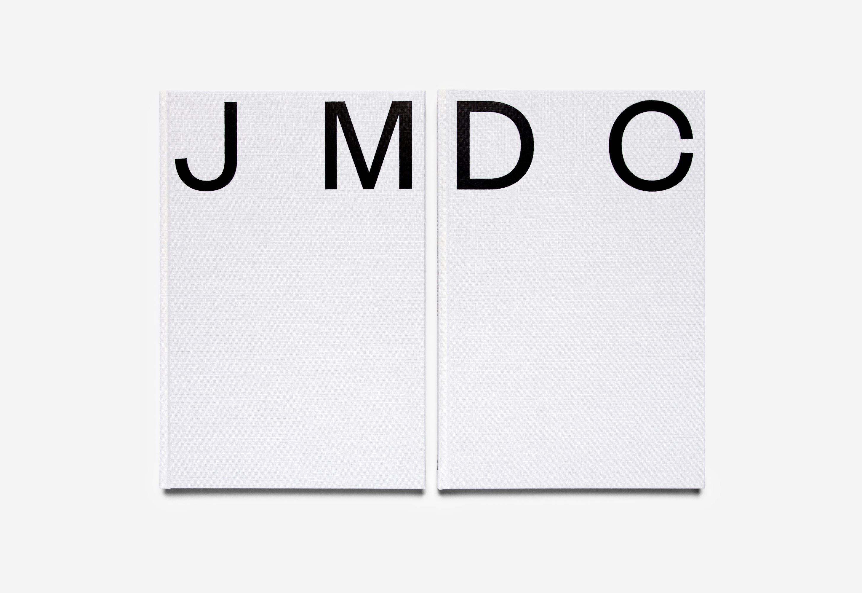
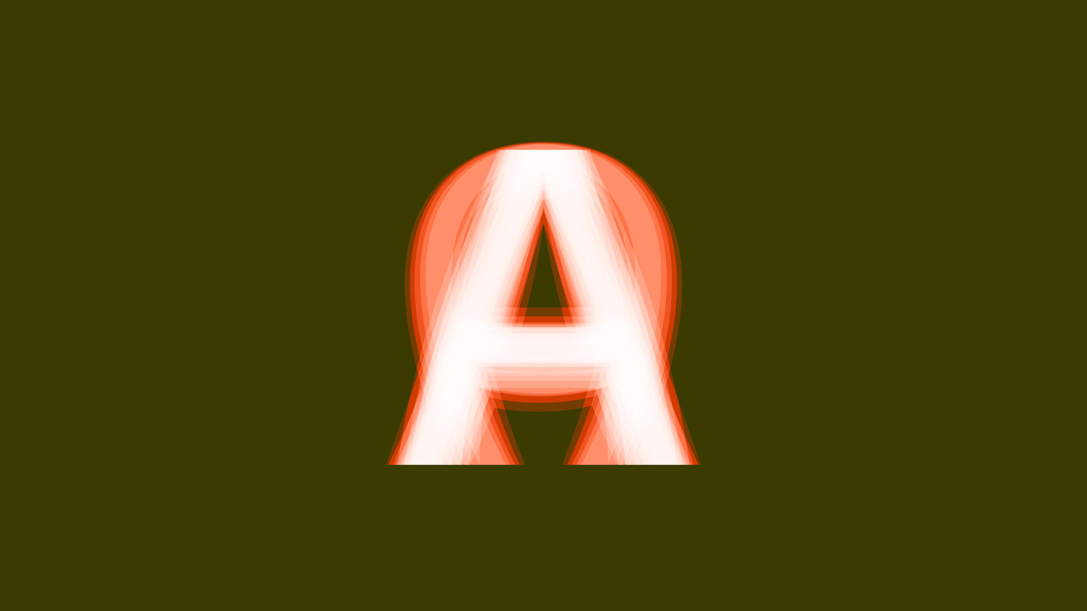
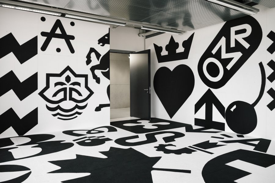
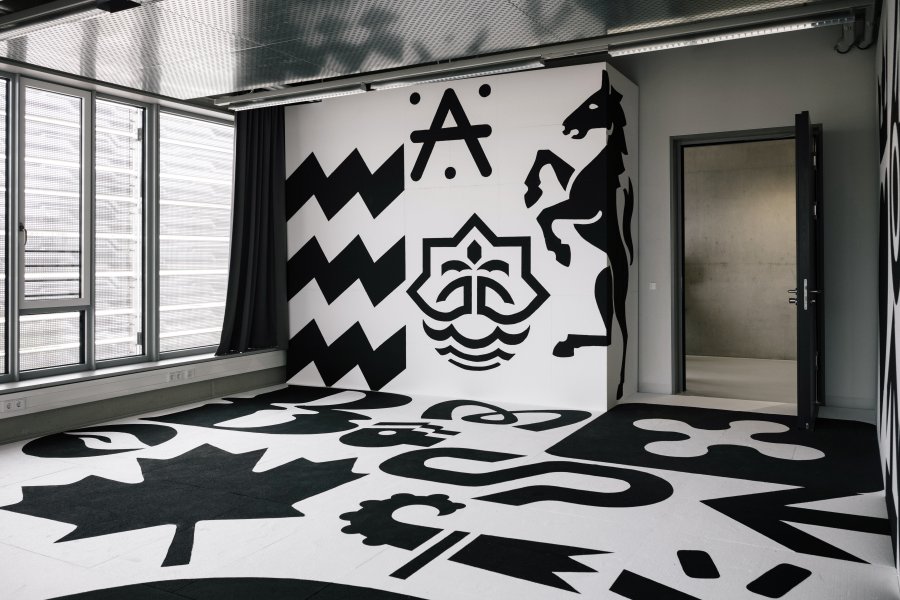
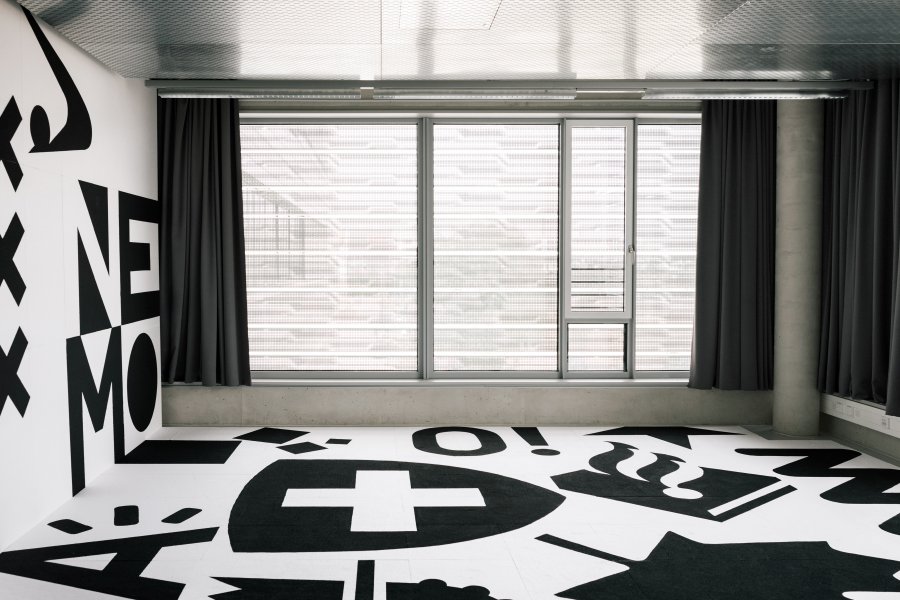
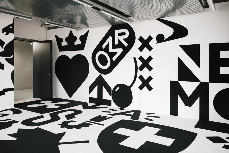
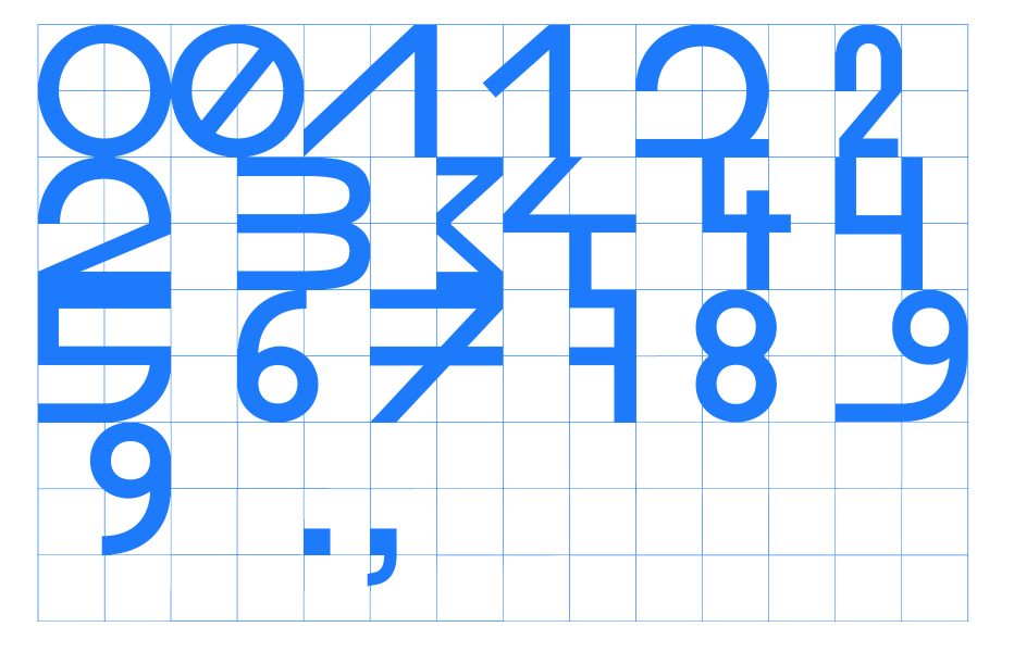
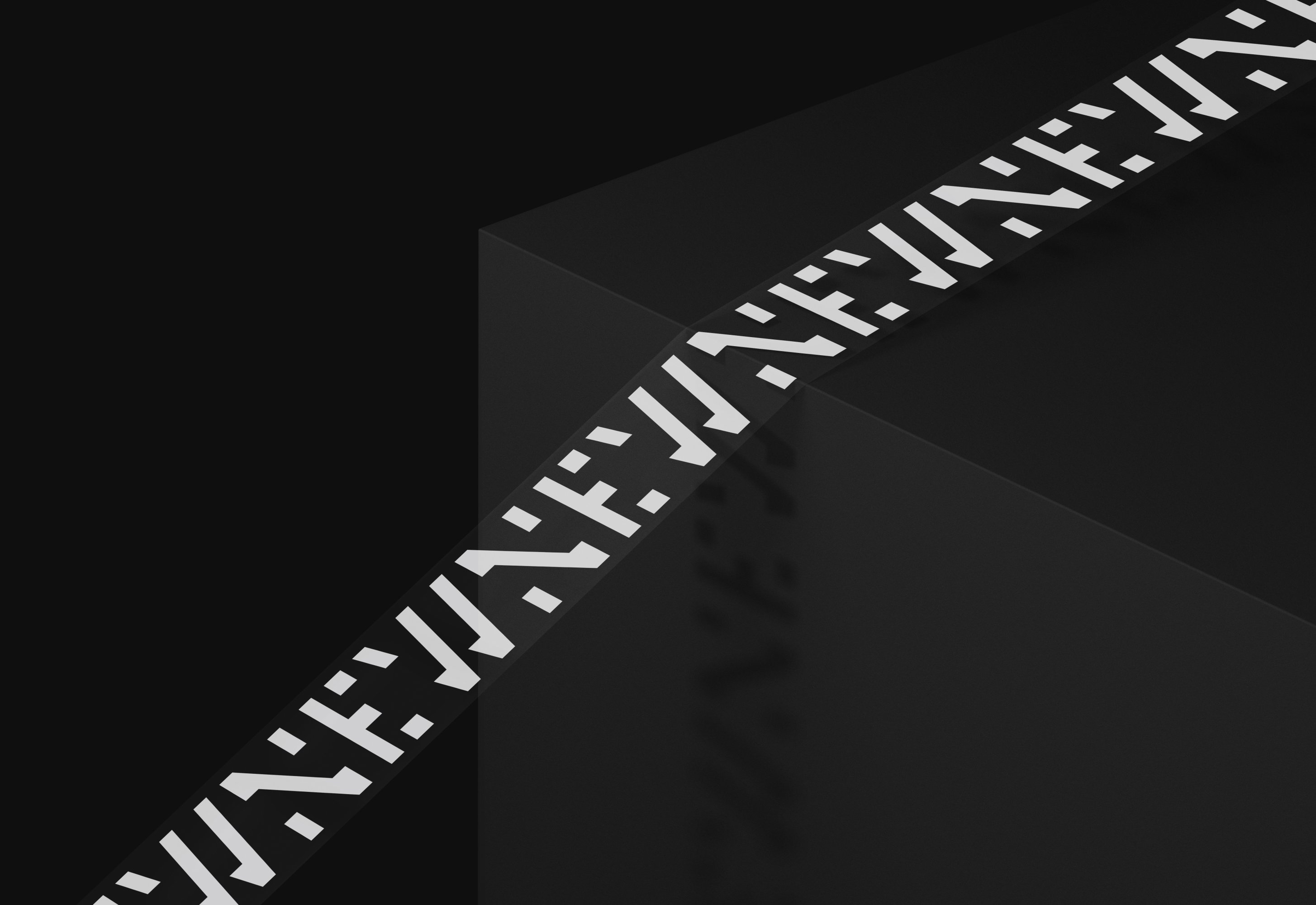
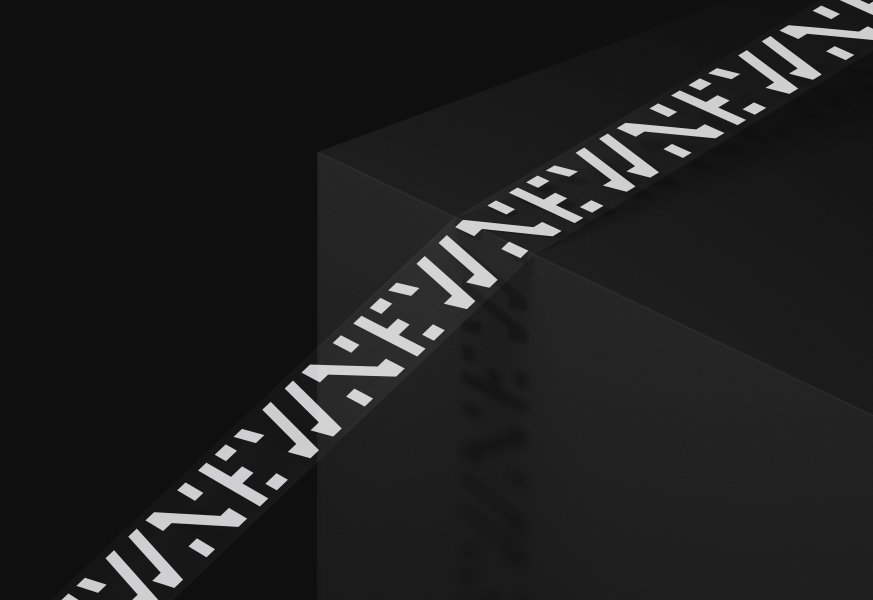
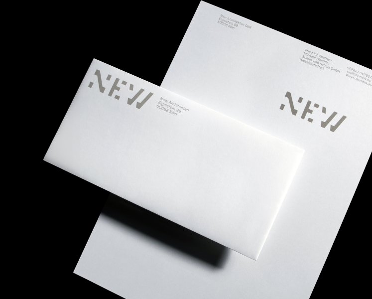
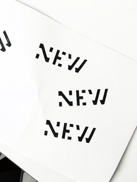
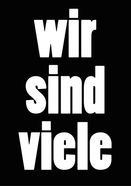
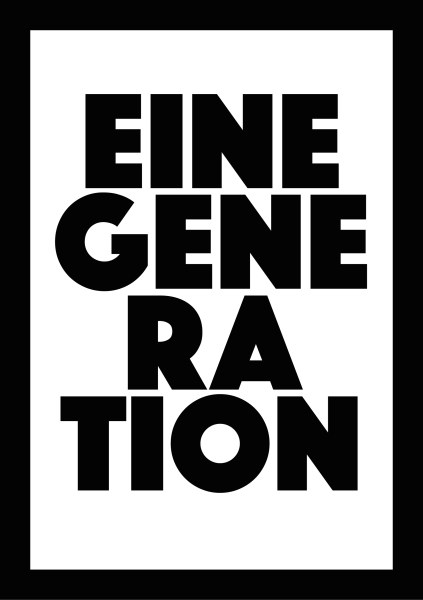
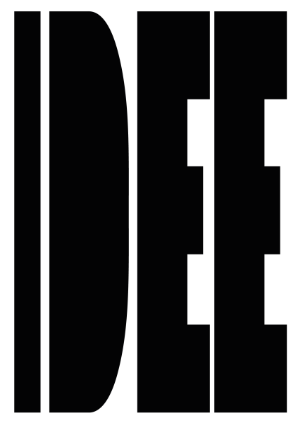
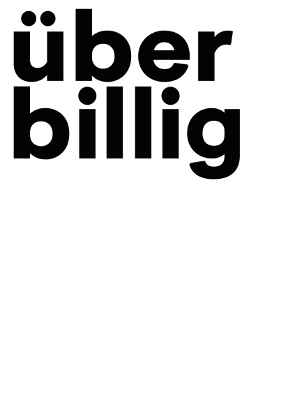
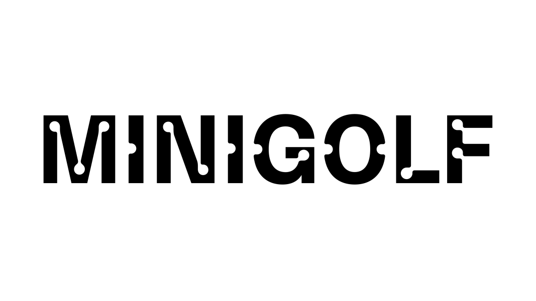
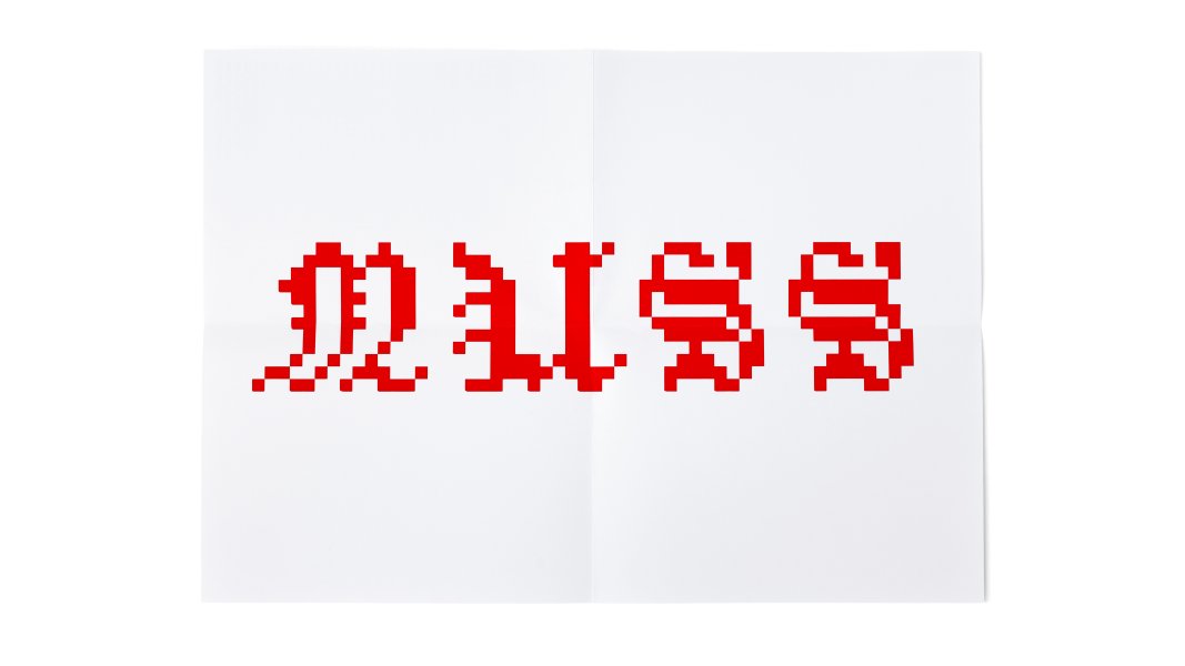
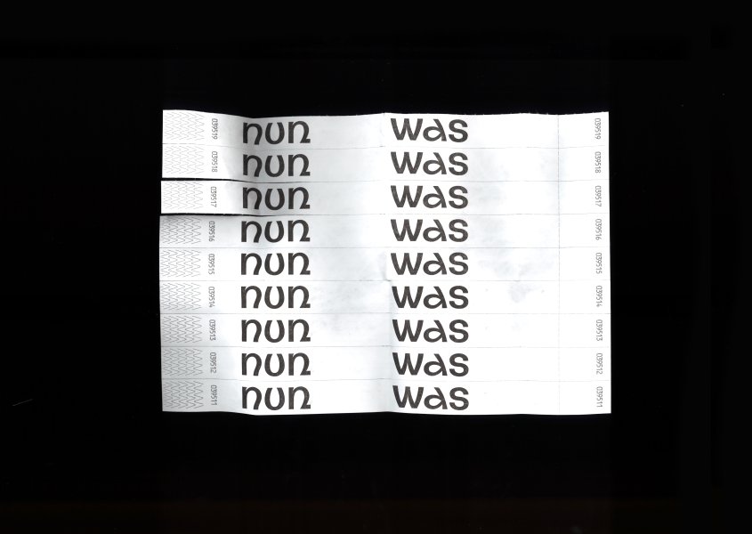
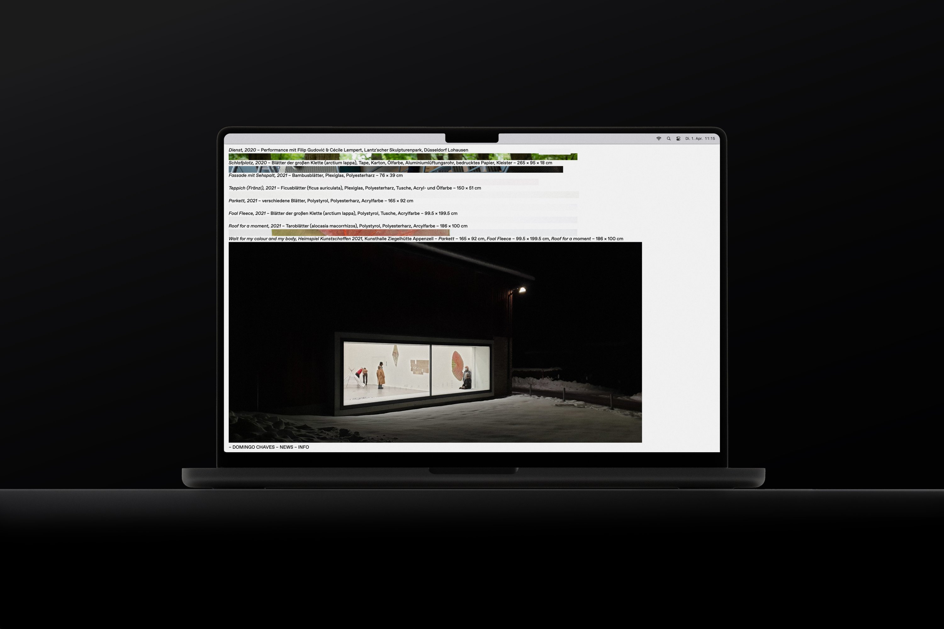
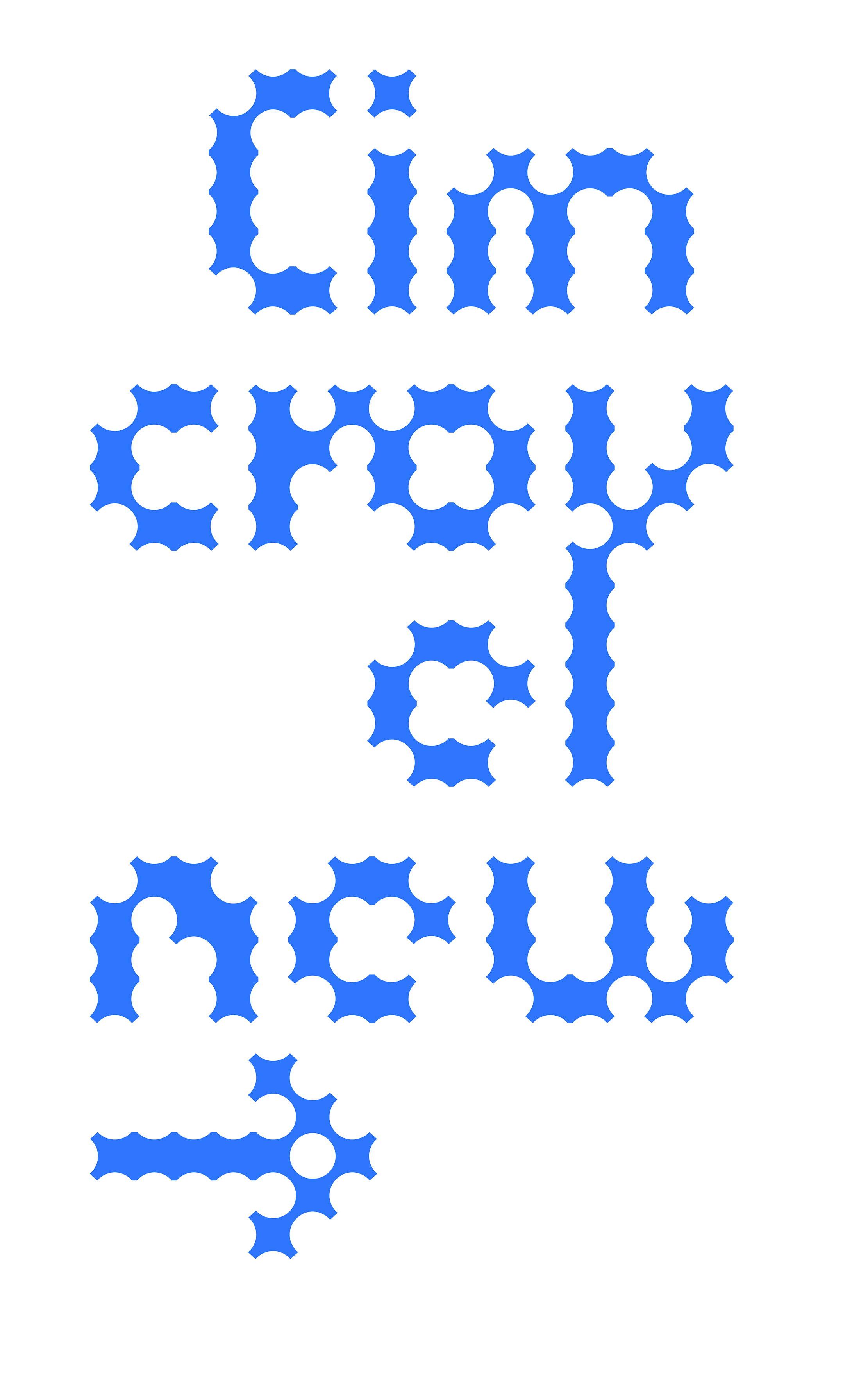
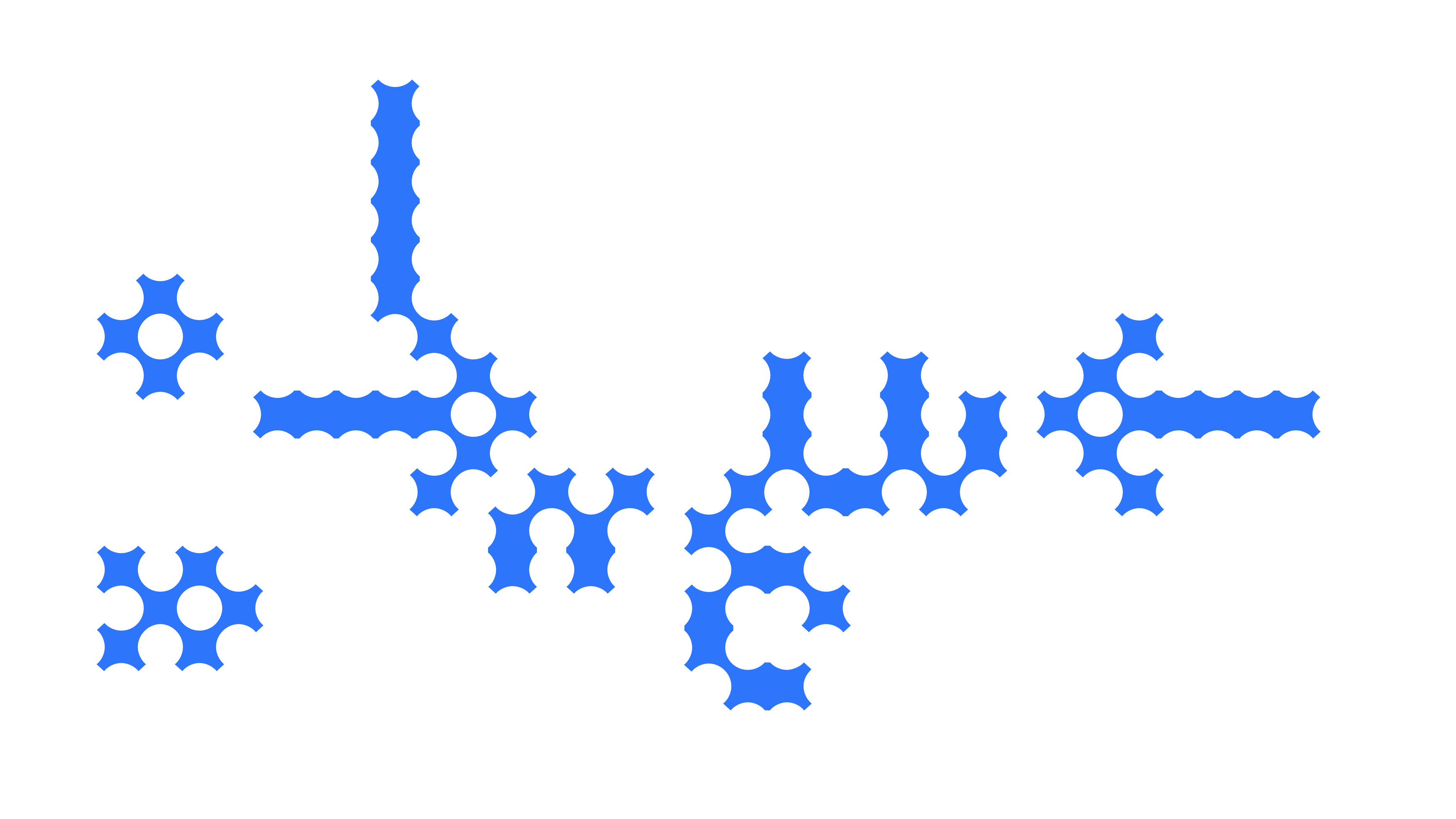
NEW CROUWEL

Typeface – please get in contact for licensing

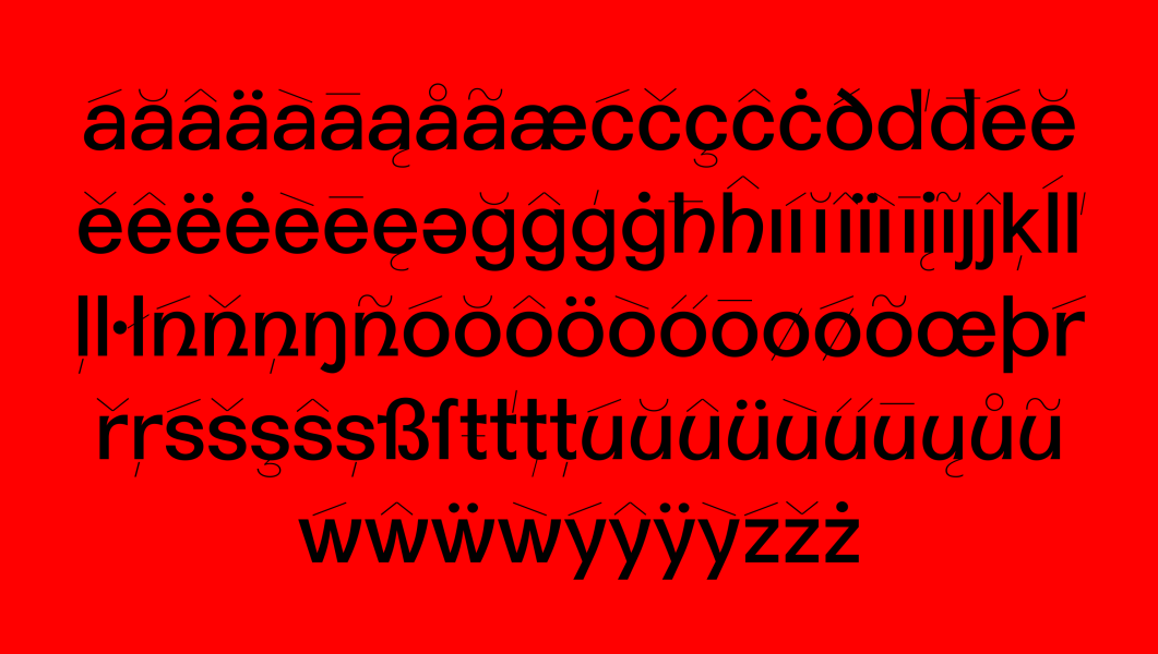
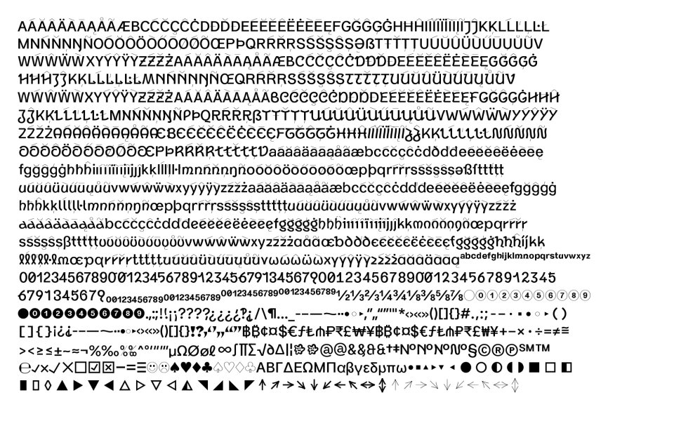
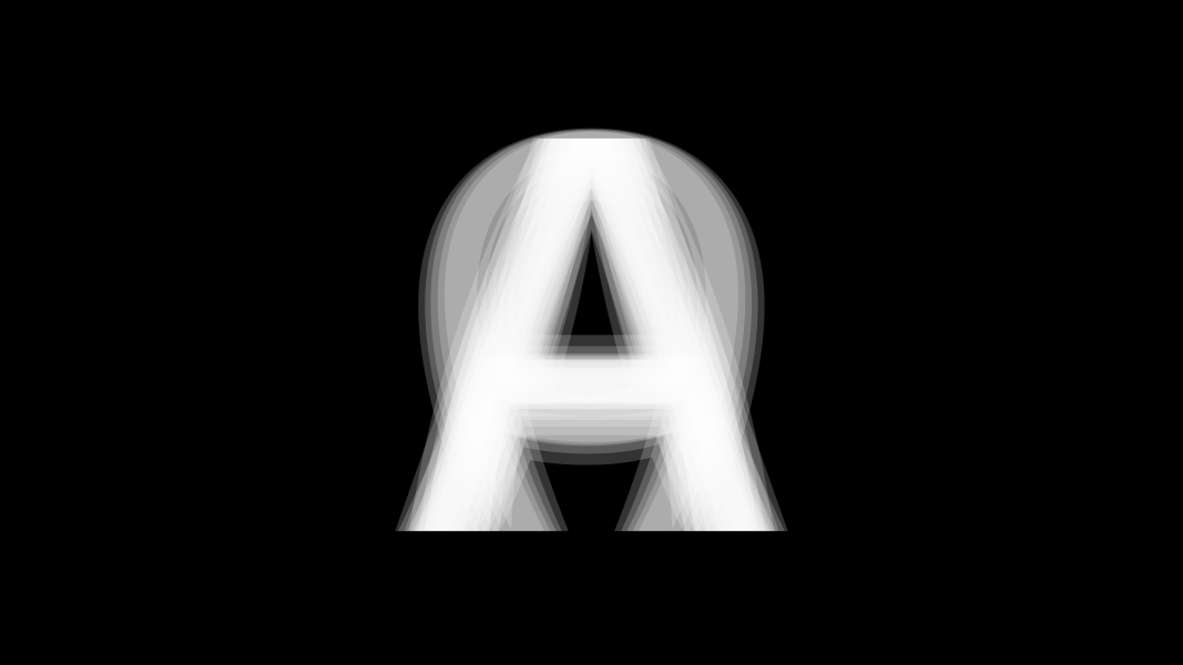
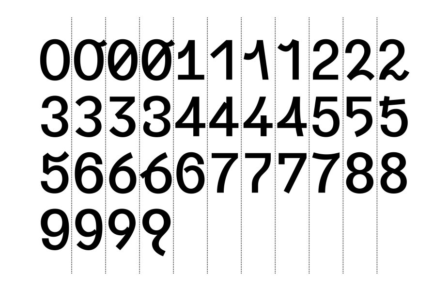
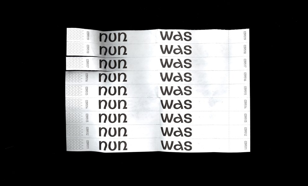
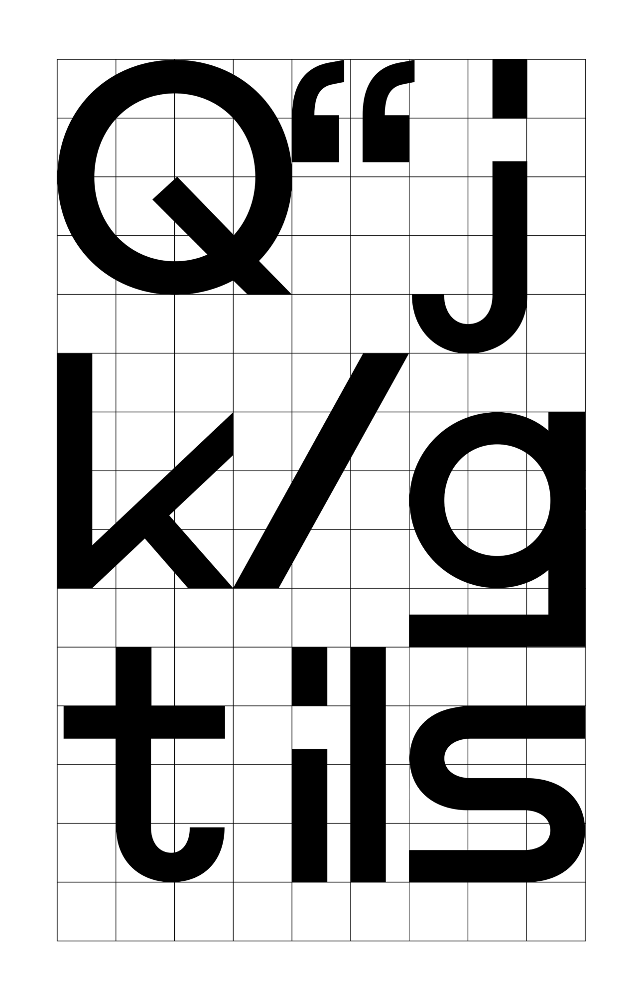
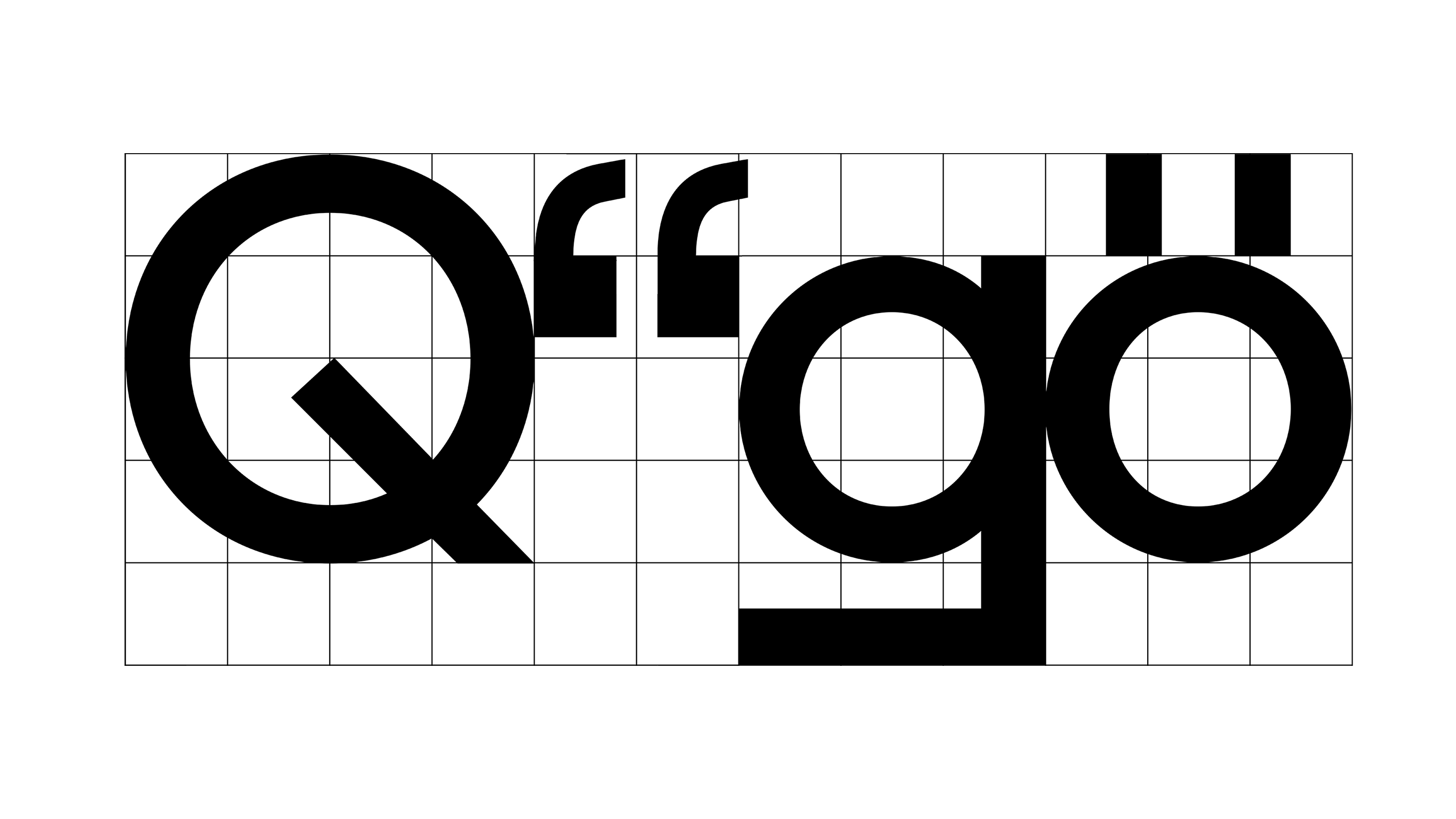
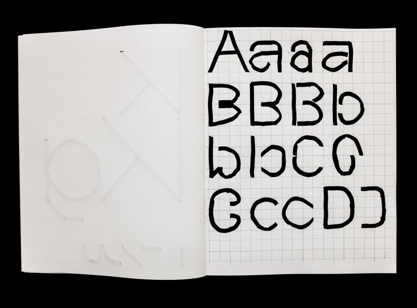
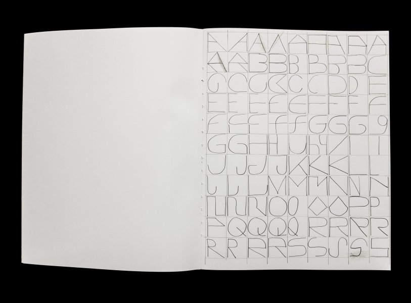
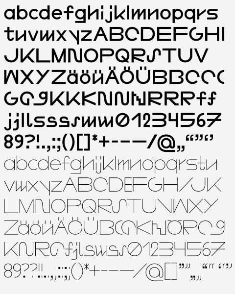
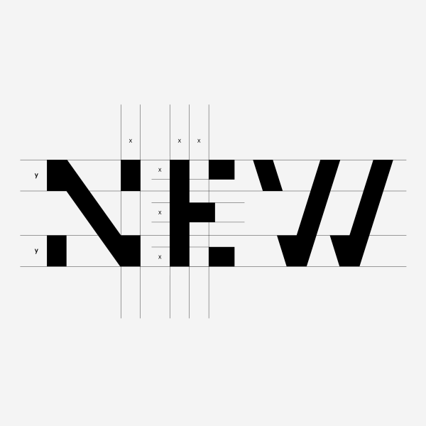
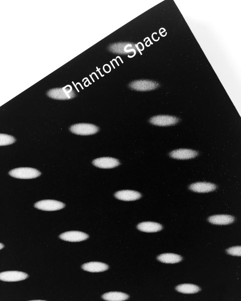
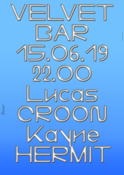
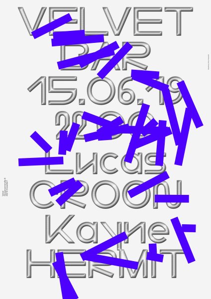
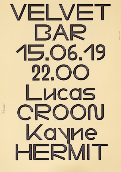
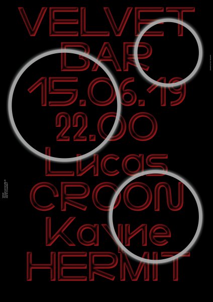
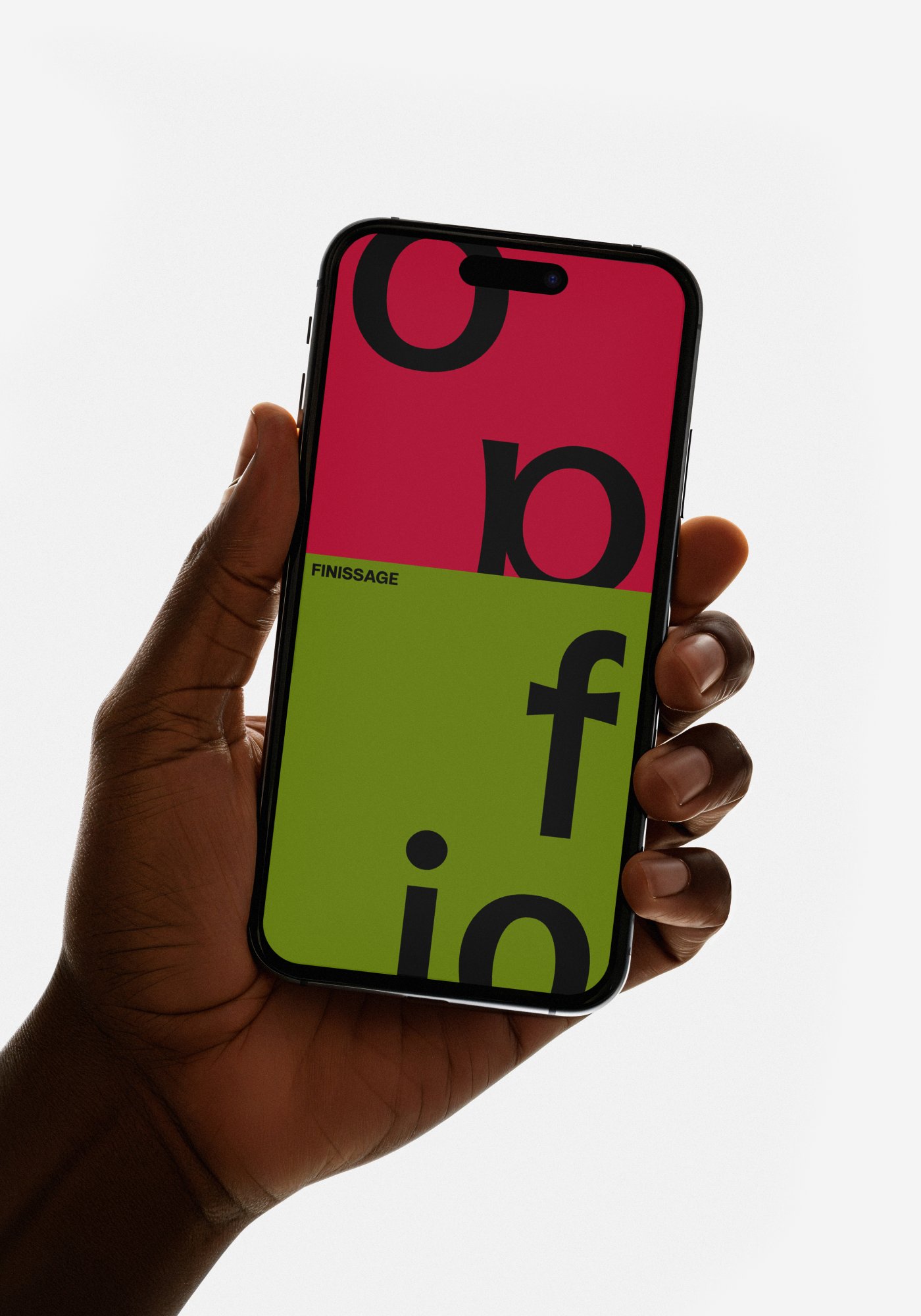
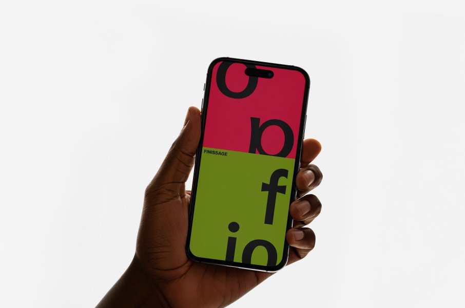
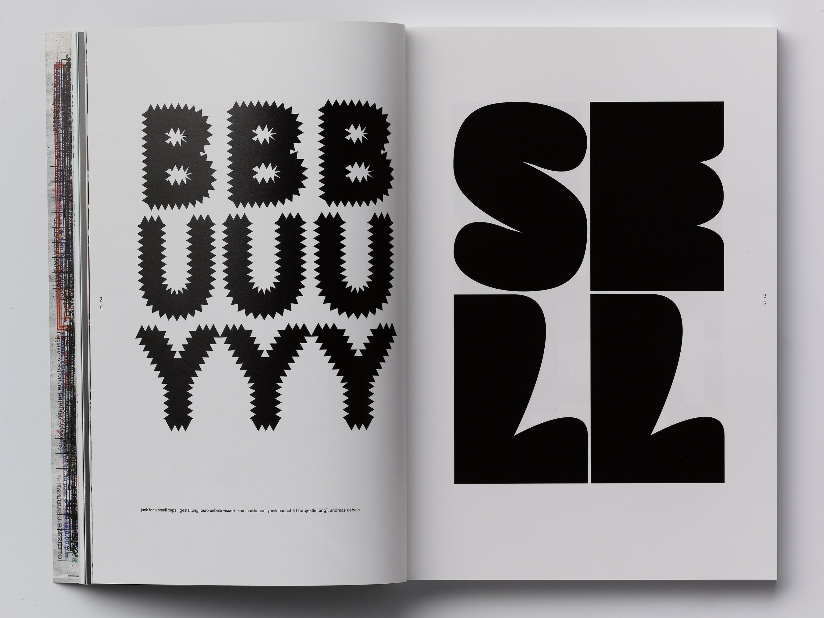
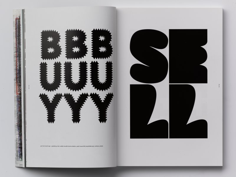
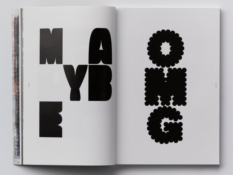
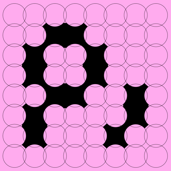
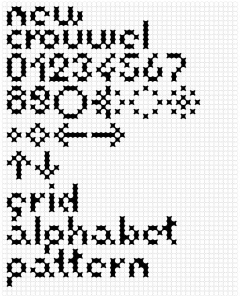
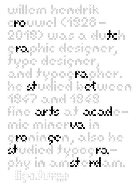
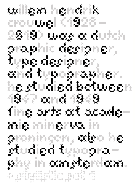
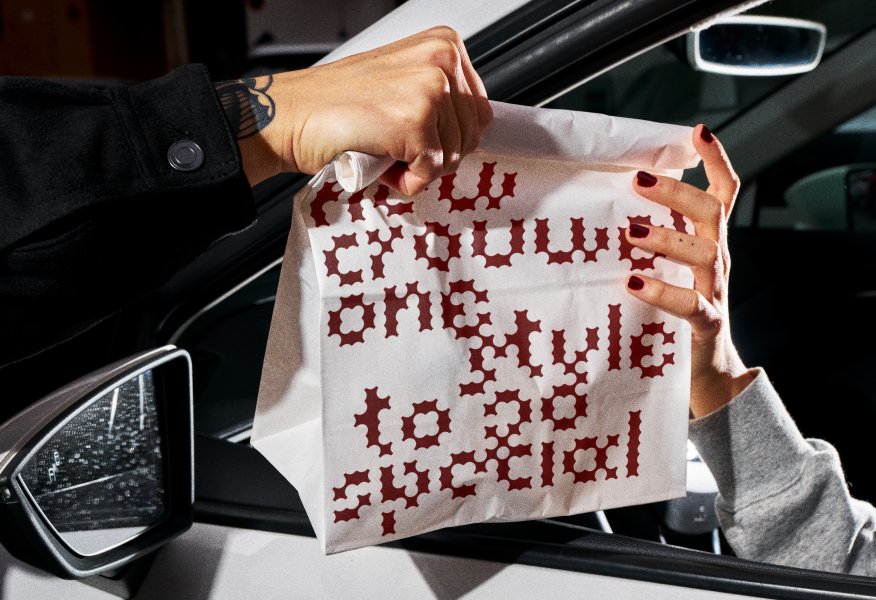
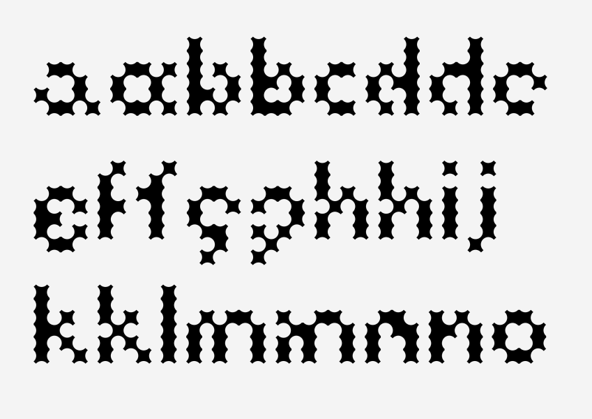
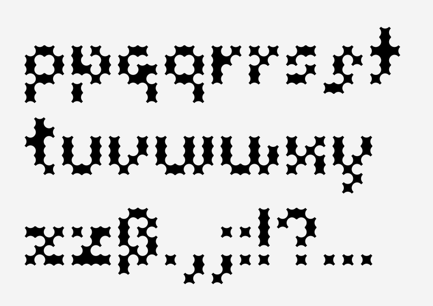
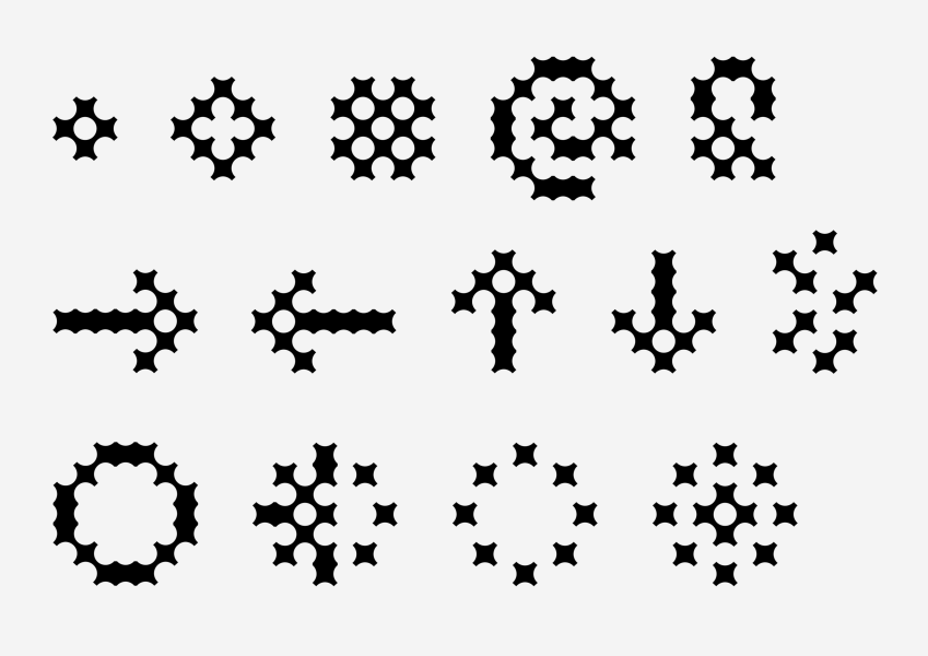
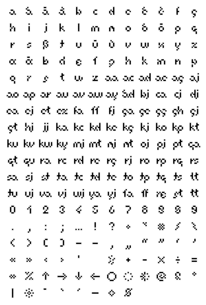
Overlapping circles in one size provide the base of this typeface. A simple structure that serve both: as space and spacer. The appearance of the circle becomes sporadically more obvious than the letter itself. It is a play of surface and white space. Are the letters perforated or roughened on the edges – it is a question of size and surrounding. In homage to the fine grid work of dutch graphic design legend Wim Crouwel and his famous collection »Wim Crouwel: Alphabets«, this display typeface carries his name. A number of alternates as well as ligatures are added to the main letter set.

Christine Moldrickx
A-C-F-G-H-I-J-M-R-S-T-U-V-W-Z

Monograph

The first monograph of artist Christine Moldrickx depicts an intermediate status of her artistic life. An incomplete alphabet – beginning letters from her artworks – as the name of this book reflects this moment in her creation. On approximately 200 pages a collection of material of the last 18 years provide an insight into her practice that got into spotlight due to Moldrickx honouring at GWK Förderpreis, 2018. It is a gathering of suggestions, fragments, considerations and results, arranged with texts by Sara Giannini, Hans-Jürgen Hafner and John C. Welchman.

Verlag Kettler
German, English
ISBN 978-3-86206-685-8

David Czupryn & Jochen Mühlenbrink

Kunstmuseum Solingen

Catalogue

This catalogue appears twice. Two artists, David Czupryn and Jochen Mühlenbrink, are showing their work simultaneously at Kunstmuseum Solingen. One could say it is a group exhibition as both work on the perception of space, things and material – it makes sense to show them together. On the other hand their approach differs immensely, which is why both are presented on opposite floors. As the overall theme of the exhibition is the artists and not the technique, the catalogue(s) has/have to represent this affair. There are two books that can be taken and bought individually but are combined by a loose jacket for the presentation within the museum. Both make use of the same structure to display their bond. The layout itself continues their reference: the page numbers are corresponding and switching their position each spread. It creates a duality and rhythm, which allows for various options to present the images.

Verlag Kettler
German & English

ISBN 978-3-86206-819-7
(David Czupryn)

ISBN 978-3-86206-820-3
(Jochen Mühlenbrink)

BLOW

Typeface – Buy a license via nice to type

Blow is a dynamic sans serif in five weights. Rooted in medieval style, Blow shifts from firm forms into smooth curves and waves. For each alphabet and figures, numerous alternates come in three steps, taking the idea of hard and soft forms with each step a bit further. The typeface ranges from graphical strengths to dynamic elegance. While the main stroke remains linear, the soft curves alternate with strong straight lines, merging into each other and forming the unique characteristics of Blow in all of its five weights. Letters like the lowercase ‘n’ unite both areas in the default characterset beforehand, while other forms emerge within their alternates: For example, the straight stems of the uppercase ‘A’ slightly curve inward, outward, just to transition into a streamlined form. Purposefully used, Blow allows the designer to have a lot of options to work with.

Design support by Gabriel Richter
Download the Specimen

NeueArchive

Identity – Self initiated

NeueArchive is founded out of the desire to create something. The project evolved during the Covid lockdown, which – next to all the restrictions – gave time to rethink. Every new creation implies some kind of accumulation, every buy distributes to your own archive. The initial product is a simple but well thought through WhiteBook. It is produced at the highest standard in material and manufacturing as you would find in art catalogues or books, without a prominent branding on the cover or inner pages. Just a blank white book that feels nice and can be taken over by oneself.

Consequently to the approach the visual identity of NeueArchive itself is subtle. It appears very slightly and works by the inner core – the language. Every word is written with capital first letters, which allows to let out any blanks. The pure necessity is enough to create an unique characteristic.

Together with Mats Kubiak

Helena Hiegemann

Website

Look at all those beautiful images; random in size and order. Very easy to click through. I like it. Where can I call? Ah there on top is the number. Let's reach out to this Paris based stylist Helena Hiegemann and work together. Sometimes it can be so simple.

Kunsthalle Düsseldorf
Akademie [Arbeitstitel]

Exhibition Identity

The face of an exhibition is the artist, the artwork or the theme. But what to choose if more than 100 artists are presented over a period of various months? Kunsthalle Düsseldorf dared to prompt this question in their exhibition »Akademie [Arbeitstitel]«. There is an opening without any exhibited artworks, a closing event without artworks, too; and in between five months of steady conversion.

This special concept behind the exhibition is depicted in the amount of participating artists – which is why their one hundred names become the pictorial element of the exhibitions communication. They are written by hand directly onto the walls, flyers and posters. In that way the steady change of artists can be visually transferred to the communication by a simple procedure: The ones that are marked, are presented at the moment, the ones that are already done, are crossed out. The communication takes part in the evolution of the exhibition and functions like a wall planer. Who is on show right now, who did I miss and who is still to come. All information can be perceived quickly. It is written on the wall. 

The handwritings distinct character creates a strong visual language and therefore becomes representative. It is functional and sovereign. It is a constant companion.

Photos by Maurice Kaufmann

Andreas Uebele, material

Monograph – Work for büro uebele

What is beautiful? What is functional? What works and what doesn’t? Where does it feel wrong and why? This book is a sketchbook, a project catalogue, a collection of interviews and a volume of essays. It explains and describes with and through pictures. It’s a book for reading and for using, a collection of material and materials. It presents 85 projects along with the materials from which they emerged – interspersed with material by people who’ve accompanied us along the way: Kai Bierich, Joachim Blüher, Hannes Böhringer, Matthew Carter, Andreas Cukrowicz, Adrian Frutiger, Durs Grünbein, Hans Hansen, Klaus Klemp, Norbert Lammert, Jórunn Ragnarsdóttir, Thomas Ruff, Karin Sander, Manfred Schmalriede, Klaus Schmiedek, Eva-Maria Schön, Massimo Vignelli, Hermann Zapf and Peter Zizka.

English:
Unit 32 , Unit Editions
ISBN 978-0-9956664-2-9

German:
Verlag Hermann Schmidt
ISBN 978-3-87439-875-6

Schrift und Staat

Exhibition Space

An empty room, only dressed up in logos on every wall and the floor. Fiction? Photoshop? Graphic designers headspace? Or just the exhibition space for a book presentation about Visual Identities?

In collaboration with Nico Schröder & Paul Andermann
Photos by Mats Kubiak

Kunsthalle

Typeface – Licensing in progress …

Sometimes the defeat isn’t that bad (which actually is a lie). The Kunsthalle Düsseldorf asked for a redesign of their visual identity and invited three studios to take part in a competition. Only one rule was given; to use the current logo. It consists of two squares with a capital »K« constructed into the right one by using the diagonals. As there was already a start, the continuation of this identity called for an individual typeface that pursues the fundamental logic of the logo: Square, diagonal, median, circle. Over the time of the competition a Regular, Medium and Bold version of a geometrical typeface was developed and accompanied by a more equalised »Text« version that could be taken for copy text, letterhead etc. In the end the submission wasn’t chosen but there is still the typeface, which turned to good purpose in various occasions since then. And they all lived happily ever after …

Design support by Gabriel Richter

Düsseldorf Photo Plus (+)

Identity – Invited competition, not realised

In 2020 »Düsseldorf Photo« introduced its rather bulky »+« to reference the variety of mediums that congregate under the title of photography nowadays. The change of name and orientation was calling for a new visual representation, which is why the committee invited for a design competition. Addition is usually signed by a »+«, also in this case, but in the field of photography it can also appear as focus and zoom. This proposal focuses on that: The plus as an idea of content as well as visual representation of the category. The symbol can be spread as an underlying grid in a light version (addition) and functions as the main representative in a solid cut (focus). The typeface »Parabole« ties it all together; its expansion in four directions mirror the broadening of the main symbol. The graphics are accompanied by »wrong« RGB colours referring to the new orientation of the event.

Typeface by Dávid Molnár, ECAL Typefaces

Tiroler Landesmuseum
Looking Ahead

Identity – Invited competition, not realised

Tiroler Landesmuseum invited studios for a competition to design a small Identity for an upcoming exhibition that highlights young artists work, a showcase on current developments. The main element is a specific website, which could be reached from the museums site and gives information about the exhibition, associated events and portraits of the artists taking part. The given name is »Looking Ahead«, a view into the future. In the end this proposal was not chosen – and the gaze went to the floor.

Thomas Huber

Website

Swiss artist Thomas Huber was looking for a new online representation that solves a number of problems: quick access to his catalogue of works from more than 40 years with a traceable connection between his series of works, catalogues as well as editions – and the collectors, art historians or gallerists should be able to find specific works and exhibitions easily. After all everybody was missing the nicely to look at big images. Such a clear vision and understanding of the objective resulted in an intuitive archive, a combination of structure and generous imagery. Zoom in, zoom out. An easy to use keyword search allows for shortcuts between all content, while everything is presented in three languages. A status that now extends into the future.

Have a look www.huberville.de

Nidus, Das Haus im Buch

Publication

Nidus architecture studio approached together with long-time AD editor-in-chief Oliver Jahn around 100 personalities practicing within the field of architecture with the question of their favourite architectural book; the one they always come back to – and why. It resulted in an extensive exhibition shown at Nidus Architekturgalerie in Düsseldorf, presenting the books alongside each personal note of the contributor. As all this highly informative and entertaining material was already gathered it was a natural step to merge everything within a book, too. The publication includes a photograph of the personal copy of each book submitted and the accompanying personal note, enriched with texts by the editors as well as examples of the actual personal handwritings.

Contributions by, among others: Amunt, Andreas Murkudis, Andres Lepik, Christian Haas, Ester Bruzkus, Fala Atelier, Faye Toogood, Florian Illies, Franka Hörnschemeyer, John Pawson, Jórunn Ragnarsdóttir, Marlene Taschen, Matteo Thun, Philipp Keel, Piet und Wim Eckert, Pierre Yovanovitch, Regula Lüscher, Reiner Nagel, Roger Boltshauser, Thomas Kröger, Vincent Van Duysen.

Park Books
German
ISBN 978-3-03860-355-9

Paloma Varga Weisz

Website, Identity

A cabinet for the figures of German artist Paloma Varga Weisz; modest and discreet in white and grey, quiet black type and stamped with the artist signet. It serves in two ways, either drift along in the extensive collection of work and images or choose the corresponding folder if you know what you are looking for. The typeface »Chap« matches the atmosphere and guides along. As an artist does not need an extensive branding, the typography is enough to hold digital and printed matter together – the focus is on the imagery and is used in special occasions like post stamps, too.

New Architekten

Identity, Website

Construction or distraction? The logo of »New Architects« is a building. N, E and W are compiled by staircase, roof and steel beams; or are those just solid concrete blocks? Good question – is the logo even finished now or still under construction?

»will the food be printed in the future«

Poster

Poster contribution to a students projects about the topic of design and taste, the relationship from creation to cooking and aesthetics.

European Elections

Poster Series

Placed in circle as the form for unity, its parts – the stars – as a kit for thought. Series in advance of the European election in 2019.

Europe

Poster

Twelve golden stars represent the unity of the European countries on an azure blue backdrop. Their number is unchanging: the year consists of twelve months, the clocks is divided by twelve hours, twelve apostles and twelve signs of the zodiac. Due to Great Britains decision to leave the Union, the question appears how much unity there actually is and what does it mean for the remaining parts.

Selected for Graphic design Festival Scotland (second image)

Grenzlandtheater Aachen

Signage

The signage of Grenzlandtheater Aachen adapts the idea of a classical theatre entrance to the special circumstances of the space. Grenzlandtheater is located inside a shopping arcade, slightly hidden in a corner and equipped by an concavely arched facade. The new sign reacts with a simple idea to this situation. It is convexly formed, which counteracts the concavely shaped facade and solves a number of problems: The attachment to the wall can be done by two clean spots, a moment of entrance is created as the form appears further overhanging than it actually is and the 16 letter long name of the theatre can be presented in a larger size as the arch provides a longer baseline. And finally, as the letters expand into the space the signage can be perceived easily from the different accesses of the arcades’ visitors. The sign is produced of solid acrylic glass letters with embedded LED lights, mounted on a powder-coated steel tube.

Produced by Werbetechnik Hennicken Theater renovation by New Architekten

Claudia van Koolwijk
Portraits 1980–2021

Publication

A book like a cube. Small, only 9,5 × 11,2 cm, in dimension but still 800 pages thick. Claudia van Koolwijk always liked these small publications that you can find next to the counter and which attract your attention on the go. A tight budget in design allows sometimes for the most specific solutions. In this instance it was the sheer amount of portrait works that Claudia van Koolwijk has taken in more than 40 years. From the beginning it was clear that a significant reduction will not be an option but still the budget did not allow for a – typical – presentation in grateful size. The result is an attractive little cube, which is carefully bound to still allow for a good handling.

Claudia van Koolwijk studied at the Kunstakademie Düsseldorf in the painting classes of Fritz Schwegler and Alfonso Hüppi. In the 1980s she began photographing the faces of her artist friends, her family, and also herself. Her photographs have a pronounced narrative character and skillfully oscillate between documentation and setting, reality and art. She interweaves images taken from art history and Catholicism with her own story, using costumes, fabrics draped in folds, staged backgrounds, flowers or body paint.

Verlag Kettler
German
ISBN 978-3-98741-018-5

Christine Moldrickx

Website

Chaos and order – impression and information. The website of artist Christine Moldrickx serves both.

Claudia van Koolwijk

Bilder der fließenden Welt

Publication

How does everything fit into one room – the whole world into one room? This book is a cabinet of curiosities that the artist Claudia van Koolwijk has enriched by her search for the interweaving of art, culture, religion and science. It is about the relationship between material, such natural objects like stones or shells, and the superhuman: the suffering, death and faith. Claudia van Koolwijk studied biology next to her education at Düsseldorf Art Academy. On one hand the precise, meticulous observation and on the other free, feeling driven dispute. This entanglement is carried over into her series of embroideries. They are snapshots, rich in detail but not illustrations – neither the technique allows it, nor does Claudia van Koolwijk aims towards it. Perfection can only exist in nature. Found material is the starting point, the approximation and interpretation follows in form of a line drawing, the colouring is done afterwards in watercolour. The manual drawing is translated into digital form, filtered and machine-embroidered onto the base fabric. Both the approach and the result are analogue and yet the work is created digitally, the process in between is a chamber of wonders in itself. Material becomes matter.

Salon Verlag
German
ISBN 978-3-89770-561-6

BeL Sozietät für Architektur

Identity, Website

Cologne based architects BeL Sozietät für Architektur were challenging their visual identity by putting the core, the word mark, into question. The office creates atypic solutions by bringing a form of elaborated humour into action, which is not usually seen in the field of architecture. Their name »Sozietät« gives a hint firsthand, as it is a quite old fashioned denotation – more used by attorneys – to name an association. BeL is playing with this perception. People and objects in their drafts or prospects are taken out of paintings, are wearing antiquated dresses or hats and sometimes a lion jumps out of the hedge. Nonetheless the architectural solutions by BeL are grounded in the here and now, appear fresh and young.

This mix is taken into consideration when working on the identity. After various steps of tryouts for a new word mark, the selection became more and more narrowed down. The decision had to be made, how far they want to present themselves in form of a logo. How much »Logo« is too much and how much is necessary. Finally the conclusion was the most simple: The typeface »Pondre« is a modern reinterpretation of the all time classic »Garamond«. It is used in one size only and appears on all printed applications in shiny black embossed. The printed matter itself is all in soft, joyful light blue. Old techniques new interpreted.

Take a look www.bel.cx
Coding by Fernando Díaz Azancot

Dakitec’

Identity – Work for g31

Dakitec’ is a young digital agency for custom software and web applications. Its most difficult task – apart from the usual one of attracting potential clients – is to draw the attention of talented developers, as they are likely to be recruited by the common big tech companies. This circumstance is reflected in the new appearance: it speaks a language that does not allow any restraint, but aims for clear approachability. The Identity works as the messenger service.

An individually created pixel icon set provides imagery. It can be loud or sweet, surely it is fun and can be used flexibly on all applications. The balanced colour scheme, derived from common code editors, brings additional dynamism. Graphic clarity on the one hand and moderate disruption on the other. Straightforward, professional and to the point; this is how Dakitec’s new identity communicates. And in the process, it ignites a firework of playful animations and details. It makes you want to work with the guys, whether as a potential employee or client.

Hochschule Düsseldorf
Campus Golzheim

Publication

In 2019 the University of Applied Sciences Düsseldorf moved from their former site to a new district. In collaboration with the city administration, the Faculty of Architecture of HS-D hosted a competition to contribute plans for a proper re-use of the old campus by the students, who have been on this location for a number of years. The task was divided into two approaches; one group had to rethink the space in form of city planning (yellow), the second one respectively the building construction (blue). The publication showcases the students final contributions.

As both groups have to be treated equally in the design of the catalogue, this book can be read from both sides. For that reason each group receives its one cover while in the middle is a connecting part in form of a text by the two organising professors (white). The partition of content can be captured instantly by the reader due to the two background colours. They are present from every side as a result of an exposed thread stitching and matching bicoulour edge painting in the production. The separation becomes a connection and shines on the theme from different sides – they belong together.

David Czupryn

Website

A website can pretend or serve, be selective or overwhelming. In the case of German artist David Czupryn the result is an understatement. A long page guides the viewer through the painters various exhibitions at public institutions as well as gallery spaces worldwide. Associated texts, contributions and catalogues are presented right next to them. While you scroll up and down, the move into another content happens sideways. The navigation presses from the left, texts from the right – you never lose position.

Take a look www.davidczupryn.de
Coding by Fernando Díaz Azancot

Tobias Hantmann
Der Marktplatz von Freudenstadt

Publication

German artist Tobias Hantmann packed one of his artworks in a trailer and went on a roadtrip. The book accompanies this journey: the image, the build-up, the exhibitions along the way and the evenings until the final return to the start. »Tradition des Zeigens: Der Marktplatz von Freudenstadt« gives an impression of the artists special preoccupation of what an image can be and how it can be experienced.

German/English/Croatian/Slovenian
VfmK Verlag für moderne Kunst
ISBN 978-3-903153-95-0
www.vfmk.org

Andreas Gefeller, Fotoarbeiten

Catalogue

Numbered structure: A catalog for the photographer's exhibition at Städtische Galerie Neunkirchen. Due to the limited number of pages – which is a blessing sometimes – the index had to be placed on the inside of the cover and its flappers.

Städtische Galerie Neunkirchen
ISBN 978-3-941715-26-4

Berit Schneidereit, Phantom Space

Publication

The duty of a publication is not to respresent reality. A depicted artwork passes through multiple alterations when being shown within a book even when the idea is to be as close as possible. Some variations are just not avoidable – it stays a reproduction. The publication »Phantom Space« about German artist Berit Schneidereit provides a helping hand and makes the different perspectives of how to perceive her work to its visual topic. Berit Schneidereits work blurs the boundaries between painting and photography, her images are photographs but not a representation of reality in itself. The viewer has to unveil the content by understanding the various layers of interwoven information. Taking a close look is as necessary as taking the step back. A play of dimension is translated into the book, which starts with a series of extracts in real size. Accompanying texts are written by Maren Lübbke-Tidow and Ludwig Seyfarth.

www.verlag-kettler.de
German, English
ISBN 978-3-86206-777-0

Jonathab Barnbrook, from bastard to bowie

Poster

British graphic designer Jonathan Barnbrook stopped by at Hochschule Düsseldorf for a lecture under the title »from bastard to bowie«. The name takes reference to his so called »Bastard« typeface as well as his graphic work on various album covers of David Bowie. So it seemed obvious to announce the event in his own typeface but in this case entirely painted by hand – a hint to Barnbrooks punk music background.

Together with Holger Jacobs.

Velvet Bar

Posters

The letters are dressed up, shiny and sharp. Ready to dance at the presented event. This announcement comes in variation and makes use of the self initiated typeface »Kunsthalle«

Blau Gelbes Kreuz

Logo – Work for Interbrand

Blau-Gelbes Kreuz e.V. is a state-recognised, non-profit association based in Cologne, that supports a free, democratic Ukraine since 2014 and provides aid for the victims of the war, especially children, internally displaced persons, injured people and other people in great need from the regions affected. In support of what they do, Interbrand offered to redesign their Identity to help them spread their idea. The new Logo picks up the crosses of the old form, which idea was anchored in traditional embroidery, but transforms them in a lot cleaner and understandable approach. It is the support and work, the connections coming in and going out.

Solidarity Now

Poster

In what kind of society do we want to live? The Coronavirus and its consequent worldwide quarantine shows us solidarity between different groups and nations but also social injustices and differences in health and welfare systems. Do we stick together or move apart, it’s our decision.

Berit Schneidereit, tourist

Publication

This publication retells an experimental dialogue between the art and media scholar, author and musician Christina Irrgang and the artist Berit Schneidereit. Using an equal number of cards that the two have written down themselves and revealed alternately, they approach the nature of photography in a personal way: memory, fragment, proximity and distance. In 12 sections, various topics are discussed, using associations, quotations or situational poetry to create a multi-faceted dialogue about a medium that continues to fascinate and raise questions. The starting point and location for her narrative encounter is the artist's exhibition of the same name at the NAK Neuer Aachener Kunstverein. The exhibition title »tourist« refers to Schneidereits eager and at the same time easy endeavour to visually experience and explore foreign places through photography.

Text by Strzelecki Books
German, English
ISBN 978-3-946770-72-5

NAK – Neuer Aachener Kunstverein

PAGE 30/30/30

Typographic Works

In 2016 one of the leading design magazines in the German-speaking world PAGE Magazine celebrated its 30 anniversary. For that reason they invited 30 designers under the age of 30 years to create a graphical comment to the theme of »30« that is going to be published in the jubilee edition.

Minigolf, Luxembourg

Signage

Perforated sign at a newly build pavillion in Luxembourg by New Architekten highlighting quietly that there are small balls to be teed off.

Photos by New Architekten

Taifun Plus

Identity, Website

Taifun is an international art platform that shares and provides cultural exchange. One of their initiatives »PLUS – A project for an Aging World« focuses on the discourse of artists, scientists and practitioners from Japan and Germany; two of the fastest aging states in the world. Over a period of multiple years visits between the countries are organised as well as residencies, conferences, screenings and exhibitions to help the intellectual dialogue and work out different perspectives or solutions about ageing. A comprehensive Identity supports their work. It has to be versatile, low budget in use and ever growing while following the process. The central element is a wordmark that plays the simple idea of adding the different letters to each other – plus. It can grow and move in different direction, depending on the application and use. This move of adding up is further translated in all printed matters, like various leaflets, everyone different in their folding, as well as posters, booklets or stickers. A website serves as Newswroom and Archive, it shows the participants, events and the results. It becomes the growing data base.

Have a look www.taifun-plus.org

Laudatio, Barbara Köhler – Thomas Huber

Publication

The writer Barbara Köhler has been awarded a prize. She asks the painter Thomas Huber to give the laudatory speech. »I'll paint a picture for you«, he replies. »Yes, paint me a room«, she says, »I can put my writing in there«. The painted picture becomes a place (ORT) for the word (WORT). The preparatory watercolours and the oil painting by Thomas Huber, as well as Barbara Köhler's instructions and her speech, are brought together in this artist's book.

Text by Buchhandlung Walther König
German
ISBN 978-3-86206-685-8

Julio Ernesto Herrera Flores
Vortex

Publication

»Vortex« is a series of spray paintings by Düsseldorf based, salvadorian artist Julio Ernesto Herrera Flores. Geometrical shapes are blend into each other by displaying motion in their arrangement. The assembly is connected to a variety of photographs taken by the artists during various travels. They correspond to the themes of speed, calmness and exploration. In order to achieve a proper reproduction of the analogue technique as well as the photographs within this publication, the printing is done in six special colours following an intense image processing by Henning Krause.

Distanz Verlag
German, English
ISBN 978-3-95476-277-4

David Czupryn, holy ghosts

Catalogue

An exhibition leads to a catalogue: Accompanying the same named exhibition of David Czupryn at Städtisches Museum Engen+Galerie.

Verlag Kettler
German, English
ISBN 978-3-86206-785-5

Museum Engen

Katharina Beilstein

Website, Identity

Sculpture, shoe, vase, ring – sculptural footwear or fashionable art? The work of German artist Katharina Beilstein is on the threshold of art and design. Her website acts the same: It appears as much as an online retailer as a showcase for the portfolio. The mundanely numbered pieces are chronologically arrayed, the newest piece presents itself first, gets the most attention and the biggest space – NEW! NOW! –, the farther you descend into the substance of work, the more it appears like an archive. Still, every small box is only one click away. And one more thing: The system can be applied to all printed matter, too.

Have a look www.katharinabeilstein.eu
Coding by Fernando Díaz Azancot

New years greetings

Print

Typographic greetings at the end of the year, inconsistent and surprising. Different in material and shape but always delivered by mail.

Werkschau HS-D

Identity, Website

Yes! Wow, the – end. Now? One day. The studies at University of Applied Sciences Düsseldorf come to an end with the final presentation of the Bachelor and Master projects at »Werkschau« each year. 172 students of the Faculties of Architecture and Design present their work together in the summer of 2017 over the period of two weeks. Eight posters call the attention for this special event in a students career. They cover the walls as a repeated pattern, they interrelate and open a typographic three-letter word play.

The new structure overlays the walls and create a colourful atmosphere in a battered building that is going to be knocked down in the near future. The posters are arranged in random order whereby the words collide humorously or interact abstractly. However the approach is prosaic as each poster represents a certain event within the whole schedule. All typefaces used, »Blow« and »Format Grotesk«, have their start at Hochschule Düsseldorf, too. It makes sense to respond to the environment comprehensively.

Find out more about BLOW
Have a look www.abschluss-hsd.de

Supervised by Prof. Andreas Uebele
Together with Kirsten Bramlage, Christian Lindermann & Jonas Pelzer (Website)

Flags for the Tour de France

Installation

Winning over everything? What to celebrate? Cheering on an honest winner? The Tour de France is a controversial sporting event. The concept of fair competition had setbacks several times. Nevertheless, the race has its beauty. The clear yellow colour of the overall leader is a friendly, bright, familiar symbol. It is cheerful, as are the distances to be travelled through a crowd of enthusiastic spectators and special landscapes. This cloudy relationship is conveyed in the installation. Düsseldorf marked the start of the Tour in 2017, next to the route is the distinctive building of NRW-Forum. Two yellow flags blowing on its roof, quite casually at half-mast.

Thanks to NRW Forum Düsseldorf
Supervised by Prof Andreas Uebele
Düsseldorf University of Applied Sciences

junk font/small caps

Typographic designs – Work for büro uebele

In his USURA CANTOS, Ezra Pound castigates usury, the charging of interest, as the root of all the world’s evil. With admirable foresight, we might think, nearly 100 years later, surveying recent years in which such bizarrely named phenomena as CALL and PUT OPTIONS, CREDIT DEFAULT SWAPS and JUNK BONDS were being sold off by the millisecond. Ultimately it wasn’t just FUTURES that were being traded here but the future itself that was at stake, prompting this typographer to design SMALL CAPS for the art magazine vorn’s current issue, which is dedicated to the topic of MORALITY. And the moral of this story is: BUY SELL PUT XYZ ASAP SWAP MAYBE OMG.

Together with Andreas Uebele

Photos by Hans Hansen (1–4), Mats Kubiak (5)
Client: Vorn Magazine, Joachim Baldauf

ab – seitdem

Fanscarf

Basically a gift. Being a fan. The practised encouragement, a tribute to the love of the game, the team and the club. Pinpoint passes, fast plays, bloody tackles and sausages. Unique characters who inspire or offend. Designers are fans of beautiful words, beautiful sounds and interesting shapes – the scarf adorned with the words of philosopher Hannes Böhringer becomes both a statement and an object. »ab« (from), »seitdem« (since) the love lasts forever, forever ever?

Karin Sander, Dieter Roth

Cover Design – Work for büro uebele

Karin Sander chose to reissue the 1957 children's book by Dieter Roth for Salon Verlags »Edition Ex Libris«. We designed the cover of the new edition, whereas the information is placed – or rather has been lasered out – spaciously on the front page, which frees the view to the original cover design.

Salon Verlag
Karin Sander präsentiert Dieter Roth »Kinderbuch«, 1957
ISBN 978-3-89770-959-1

End of Term, HS-D

Posters

At the end of each term the students of lectures by Andreas Uebele at University of Applied Sciences Düsseldorf showcase their final works in an ever-changing space somewhere in the city. The public confrontation of their result is a major part in the field of design and its presentation a mandatory issue in the education of the graphic design students. Every year the event receives great feedback and its own poster for the announcement.

Together with Andreas Uebele

Peter Behrens 150

Poster

Peter Behrens was an architect, designer, typographer, artist and a former director of Hochschule Düsseldorf in the early 20th century. Nowadays he is the name giver to the universities fusion of the Faculties of Architecture and Design. On the occasion of Behrens 150th birthday in 2018 the university organised an event with an exhibition and talks about his creative work, while the German Federal Post Office published a commemorative stamp that got presented there as well.

As Behrens was a typographer, the idea was to work with one of his typefaces – however only a little number of his fonts have been transformed to todays technical standards. This was taken as a chance and the typeface, which came to use, is a reworked version of »Behrens Antiqua«. All glyphs are digitalised and refined out of his original specimen, while the necessary numbers for this application are added subsequently. The capricious figure of his typeface led to a play: the poster is silkscreen printed in four colours and a full alphabet of letter stamps were produced. Anyone interested could let their own message get stamped at the events evening and complete their set from the Post Office with the fitting letter in that way. All fun and play from analogue to digital and back again.

Together with Andreas Uebele

Kunst und Kritik

Publication/Leaflets

The theme was »Kunst und Kritik (art and critics)« that was addressed by the students of Hochschule Düsseldorf in cooperation with Kunstakademie Düsseldorf and Witten/Herdecke University: Four communication designers gave form to texts by nine authors about eleven artists and combined them in a slipcase. The graphical artworks accentuate the personal of the authors and artists by a variable layout for each contribution. Individuality is ensured however a guideline of consistent type weight, sizes and colours directs calmly through the catalogue. The typographical posters are manually silkscreen printed in a circulation of 85.

Together with Mats Kubiak, Mona Matejic & Hendrike Nagel
Photos by Mats Kubiak
Supervised by Prof. Andreas Uebele

Kunsthalle Düsseldorf

Welcome to the Jungle

Catalogue

Kunsthalle Düsseldorf is presenting a group exhibition entitled »Welcome to the Jungle«. It uses works by numerous international artists to reflect on society's endeavours to do the »right thing«. The critical, reflective and often humorous approaches are summarised in the exhibition catalogue, which – of course – has to be covered in shiny silver material.

www.kunsthalle-duesseldorf.de
Verlag für moderne Kunst
German, English
ISBN 978-3-903269-31-6

Domingo Chaves

Website

A modern card index for swiss artist Domingo Chaves, browse through the deck one by one or enter randomly. Click whenever you want to see more.

Take a look www.domingochaves.com