

»Die Jungen Hugos« by Studio Terhedebrügge in collaboration with Studio Tillack Knöll
Kunsthalle
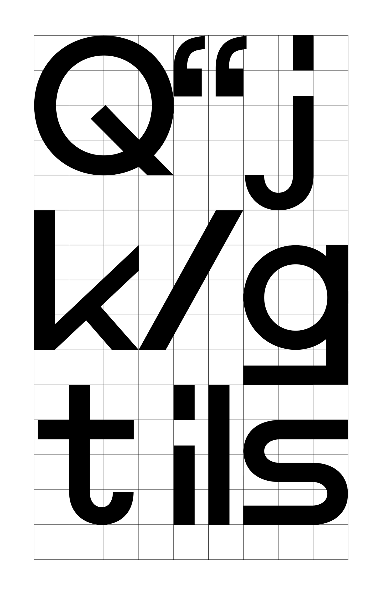
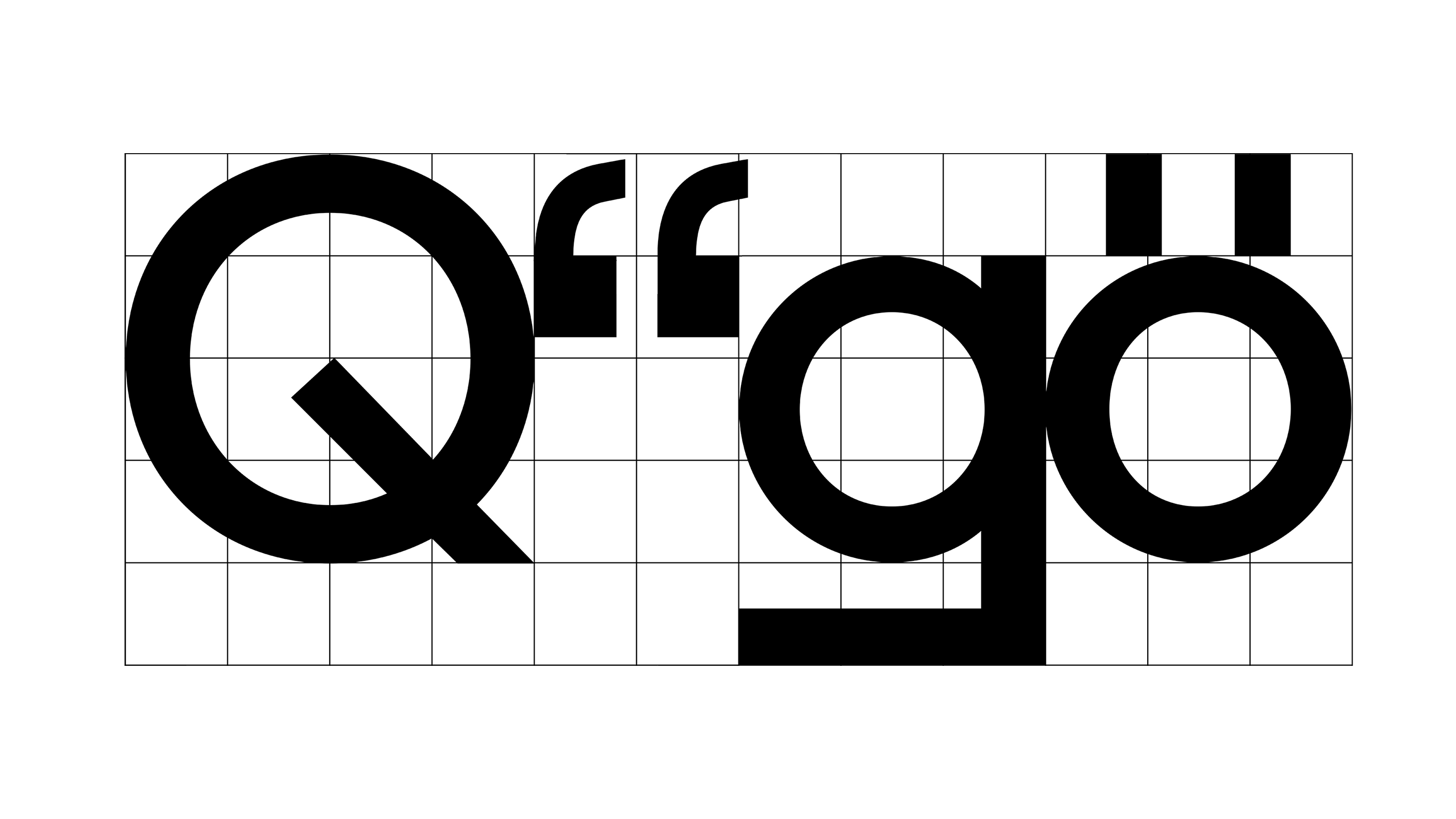
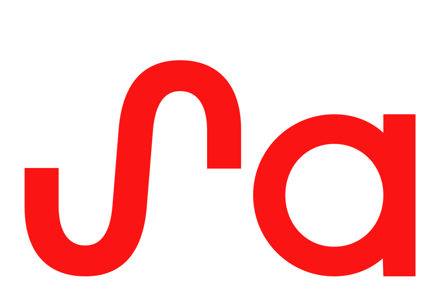
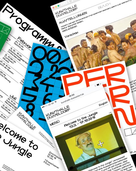
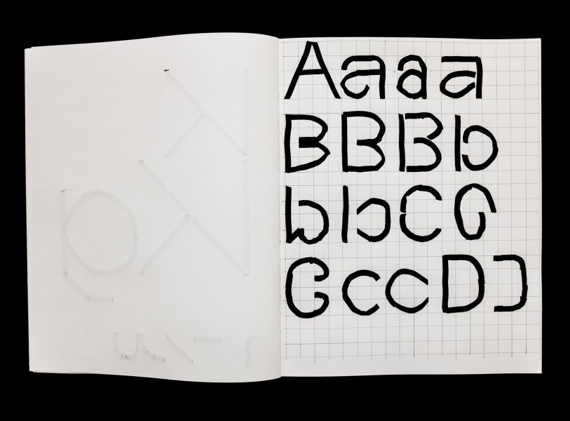
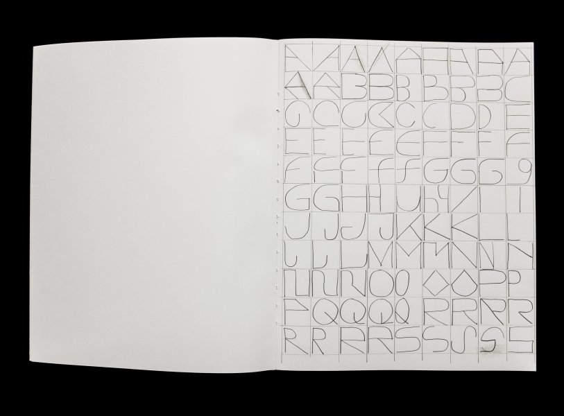
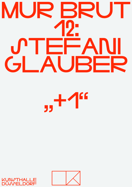
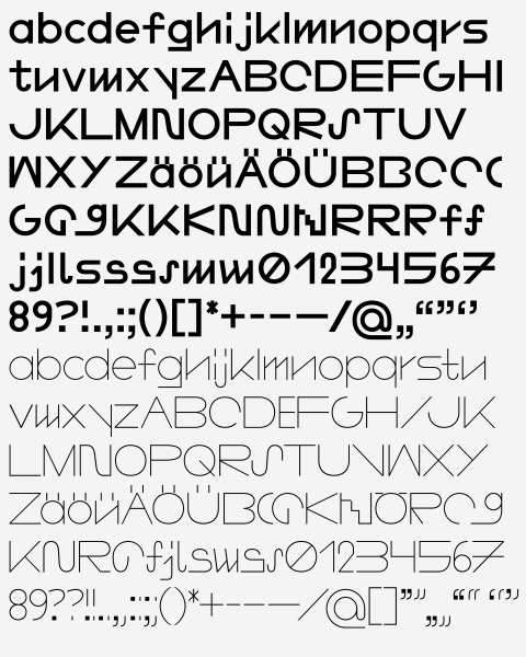
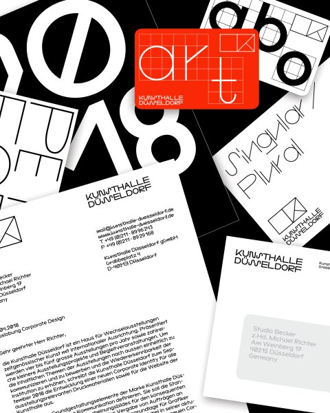
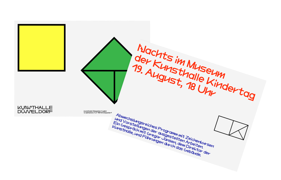
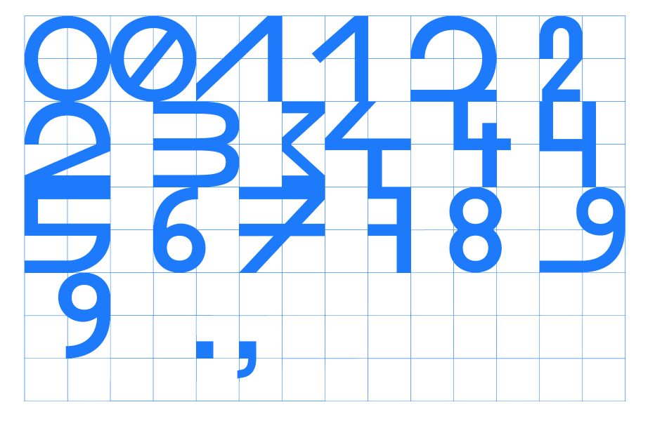
Sometimes the defeat isn’t that bad (which actually is a lie). The Kunsthalle Düsseldorf asked for a redesign of their visual identity and invited three studios to take part in a competition. Only one rule was given; to use the current logo. It consists of two squares with a capital »K« constructed into the right one by using the diagonals. As there was already a start, the continuation of this identity called for an individual typeface that pursues the fundamental logic of the logo: Square, diagonal, median, circle. Over the time of the competition a Regular, Medium and Bold version of a geometrical typeface was developed and accompanied by a more equalised »Text« version that could be taken for copy text, letterhead etc. In the end the submission wasn’t chosen but there is still the typeface, which turned to good purpose in various occasions since then. And they all lived happily ever after …